- By medium
- By subject
- By budget
- Sales
- Gift cards
- Discover all art
- Artists
- Editors’ picks
- Ideas
Original artwork description:
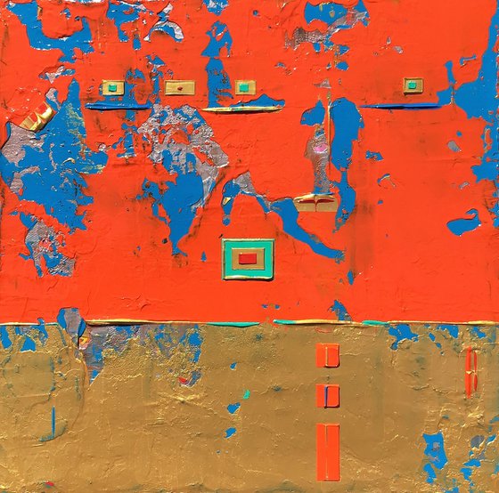
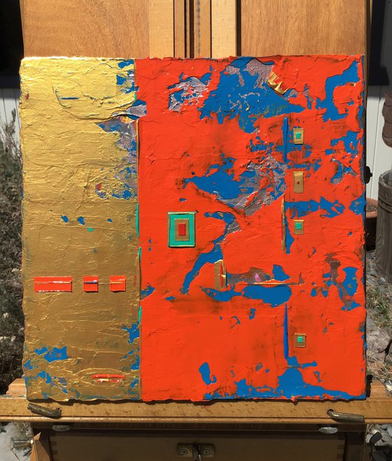
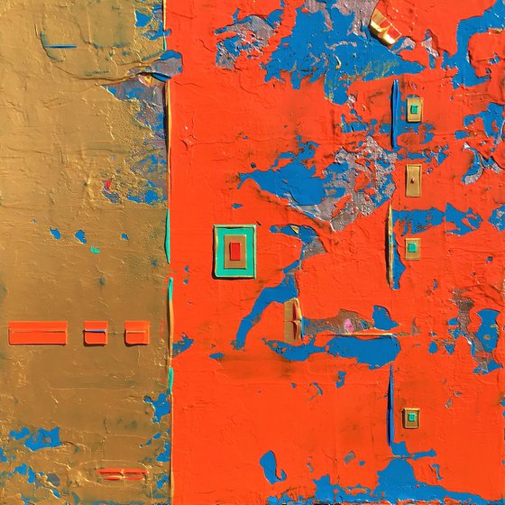
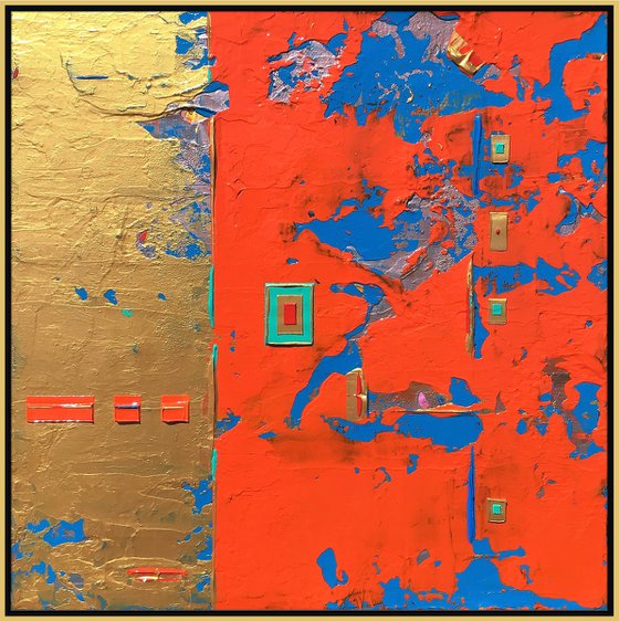
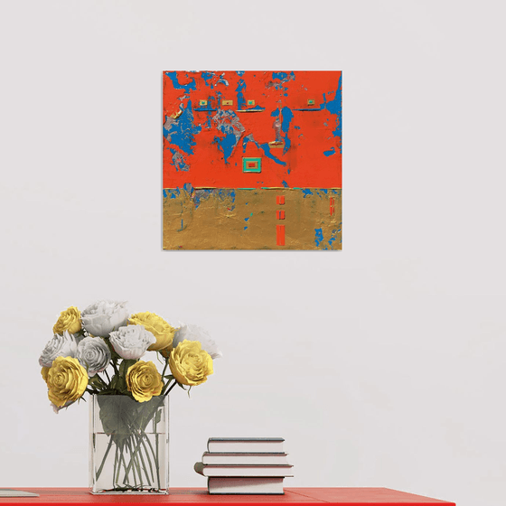
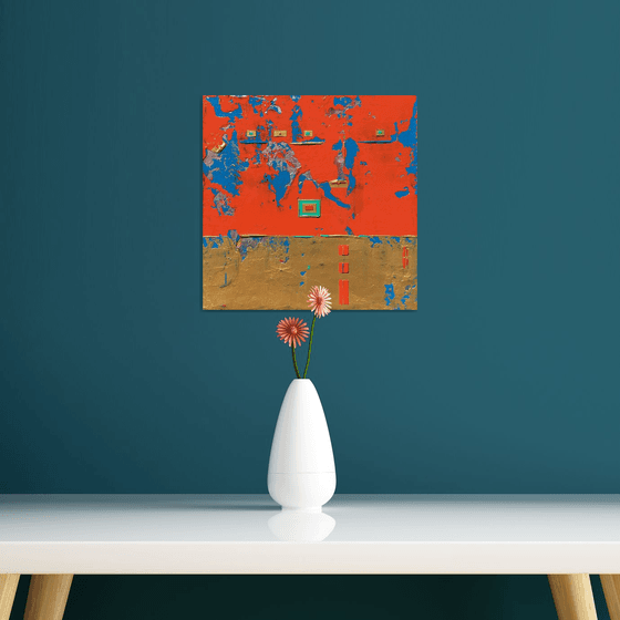
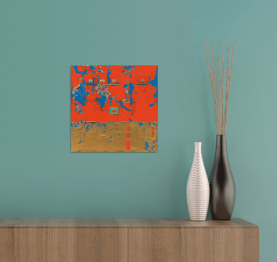
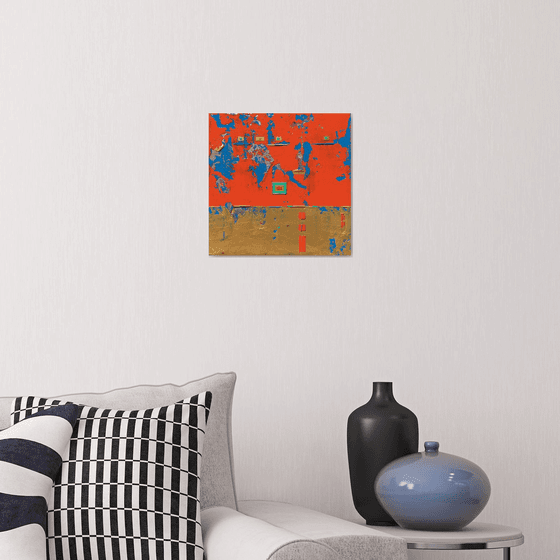
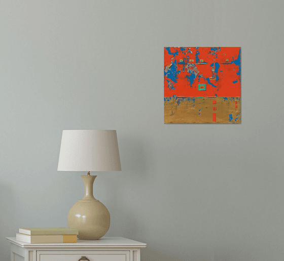
April 2021 (Unframed) Textured Abstract Acrylic Painting. Use of Gallery Wrapped Cotton Canvas 12 x 12 x 1.5. (12 Layers) I like building my canvases with layers of paint. There is a richness by doing this for this painting and many of the paintings I paint. I like using palette knives to blend the colors & patterns. I have been able to create several layers to show through in this small painting. I have several colors I have used for this Abstract Painting. There is a shade of Dark Blue, spots of Pink, Silver on the bottom layering I left open. I have a couple more layers of Blue & Gold then I layered the top layer with a Orange-Red & Gold. I then used Teal, Gold, Orange, and Red to create small box shapes to enhance the painting appearance. I have highlighted the painting with primitive markings/lines using Gold, Deep Orange, Blue, and Teal. I have focused on a abstract frame in the center using Gold, Teal, and Red. I wanted to create the focal point for the painting and the Viewers eye. I have used my palette knives to create this painting. There are 2 Vertical hangings on the backside and 2 Horizontal hangings on the backside. Felt pads on 4 corners to protect the wall. Golden Professional Archival Gloss Varnish Spray has been applied to protect the painting. Certificate of Authenticity included 1/1.
Lighting will be important for this painting or any other painting to bring out the brilliance of the colors. Overhead lighting/Spot Lighting/and/Indirect Lighting from a window are the best forms of lighting. If you do not have the proper lighting-this painting or any painting can look dull. Also, be aware of Wall/Paint colors with paintings. Some darker wall colors can make a painting look dull or not interesting. So, be aware when you purchase a painting and the placing of the painting. Always play around with lighting and wall colors for paintings.
^^^^^^Please Note-I have taken my photos with my Apple iPad. The colors on the painting are true to color. Though, The Orange-Red top layer can change depending on lighting. The Apple iPad leaned towards more to a Red-Orange. This said-The photos I took of this painting I had a very hard time getting the exact true Orange-Red feel. So, Please know the Orange-Red is 97-98%. I am working on to correct this in new photos-I am hoping. The rest of the colors for this painting are exact.
Note: I base my pricing on amount of Time, Art Supplies used, Amount of paint used, and Artfinder's % which is important since they are promoting my artwork.
Materials used:
Professional Arcylics applied with Palette Knives. Painted on Gallery Wrapped Cotton Canvas. Coated with Golden Professional Gloss Varnish.
Tags:
#abstract #red #orange #acrylic #gold #aqua #ready toThe Little Red Box Abstract (2021) Acrylic painting
by Robert Lynn
34 Artist Reviews
£340.04 Sold
- Acrylic painting on Canvas
- One of a kind artwork
- Size: 30.48 x 30.48 x 3.81cm (unframed) / 30.48 x 30.48cm (actual image size)
- Ready to hang
- Signed on the back
- Style: Abstract
- Subject: Abstract and non-figurative
Loading
Original artwork description
April 2021 (Unframed) Textured Abstract Acrylic Painting. Use of Gallery Wrapped Cotton Canvas 12 x 12 x 1.5. (12 Layers) I like building my canvases with layers of paint. There is a richness by doing this for this painting and many of the paintings I paint. I like using palette knives to blend the colors & patterns. I have been able to create several layers to show through in this small painting. I have several colors I have used for this Abstract Painting. There is a shade of Dark Blue, spots of Pink, Silver on the bottom layering I left open. I have a couple more layers of Blue & Gold then I layered the top layer with a Orange-Red & Gold. I then used Teal, Gold, Orange, and Red to create small box shapes to enhance the painting appearance. I have highlighted the painting with primitive markings/lines using Gold, Deep Orange, Blue, and Teal. I have focused on a abstract frame in the center using Gold, Teal, and Red. I wanted to create the focal point for the painting and the Viewers eye. I have used my palette knives to create this painting. There are 2 Vertical hangings on the backside and 2 Horizontal hangings on the backside. Felt pads on 4 corners to protect the wall. Golden Professional Archival Gloss Varnish Spray has been applied to protect the painting. Certificate of Authenticity included 1/1.
Lighting will be important for this painting or any other painting to bring out the brilliance of the colors. Overhead lighting/Spot Lighting/and/Indirect Lighting from a window are the best forms of lighting. If you do not have the proper lighting-this painting or any painting can look dull. Also, be aware of Wall/Paint colors with paintings. Some darker wall colors can make a painting look dull or not interesting. So, be aware when you purchase a painting and the placing of the painting. Always play around with lighting and wall colors for paintings.
^^^^^^Please Note-I have taken my photos with my Apple iPad. The colors on the painting are true to color. Though, The Orange-Red top layer can change depending on lighting. The Apple iPad leaned towards more to a Red-Orange. This said-The photos I took of this painting I had a very hard time getting the exact true Orange-Red feel. So, Please know the Orange-Red is 97-98%. I am working on to correct this in new photos-I am hoping. The rest of the colors for this painting are exact.
Note: I base my pricing on amount of Time, Art Supplies used, Amount of paint used, and Artfinder's % which is important since they are promoting my artwork.
Materials used:
Professional Arcylics applied with Palette Knives. Painted on Gallery Wrapped Cotton Canvas. Coated with Golden Professional Gloss Varnish.
Tags:
#abstract #red #orange #acrylic #gold #aqua #ready to14 day money back guaranteeLearn more
