- By medium
- By subject
- By budget
- Sales
- Gift cards
- Discover all art
- Artists
- Editors’ picks
- Ideas
Original artwork description:
Blue Velvet Reprise
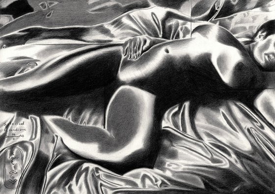
This graphite pencil drawing ‘Solarized Roundism – 24-02-23’ stems from the latest session with my regular model. Solarization is back on the menu and I simply loved to employ this technique again. So I happened to visit a local fabric store, here in The Hague. There I saw this smashing piece of blue velvet. It is almost identical to the one I used for my oil painting under the same name. It’s considerably bigger in size though. That’s what I wanted: a cloth way bigger than the one I had, almost like sheets. There are a couple of reasons for this. For years I undressed women and depicted them as such. Now I am into fabrics these days, so I wrap them in cloths or lay them down on. Another reason, especially regarding the blue quality: it sets off the skin hue of my model quite nicely.
Solarize It
Solarisation as theme I used a couple of times before. However, I like to vary as I explained in the past. After Slava Ukraini – 15-02-23 and neo deco I wanted to do something else. In fact, I was curious how my Faber Castell pitt graphite matt pencil would do using this theme. It’s all about partial inversion of tonal values and hatch the paper up to a complete darkness. See how this would contast the high lighted areas. I must say I am perfectly astouned. It was much easier to get these tonal extremities than in my last solarized graphite project of last year. Hurray for Faber Castell. I’m a big fan of those pencils now.
A Bit of Cubism
The outcome of model sessions can be rather unpredictable. Sometimes you’ll get some nice postures unexpectedly. Those are the best. This time I got a lucky shot. Her pose was in complete harmony with the satin folds and almost seemed to mimic them. That goes for the tonal varietions as to the curvatures. I didn’t have to add much cubist styling to it, which was the initial plan. Such can be seen in broken contour delineation in the thigh and the horizontal and vertical guiding lines. I set out these ones to fixate the proportions of the bodily features. I decided to keep them because they underlign the abstact quality of the result. It’s more abstract than it lets on. Through the hefty tonal variations it looks rather photographic though.
Graphite pencil (Faber Castell Pitt Graphite Matt pencil 14B) drawing Talens Bristol paper (21 x 29.7 x 0.1 cm)
Artist: Corné Akkers
Materials used:
Graphite pencil (Faber Castell Pitt Graphite Matt pencil 14B) drawing Talens Bristol paper (21 x 29.7 x 0.1 cm)
Tags:
#female form #cubism #art deco #artistic nude #solarizationSolarized Roundism – 24-02-23 (2023) Pencil drawing
by Corné Akkers
8 Artist Reviews
£1,287.87
- Pencil drawing on Paper
- One of a kind artwork
- Size: 29.7 x 21 x 0.1cm (unframed) / 29.7 x 21cm (actual image size)
- Signed on the front
- Style: Geometric
- Subject: Nudes and erotic
Loading
Original artwork description
Blue Velvet Reprise
This graphite pencil drawing ‘Solarized Roundism – 24-02-23’ stems from the latest session with my regular model. Solarization is back on the menu and I simply loved to employ this technique again. So I happened to visit a local fabric store, here in The Hague. There I saw this smashing piece of blue velvet. It is almost identical to the one I used for my oil painting under the same name. It’s considerably bigger in size though. That’s what I wanted: a cloth way bigger than the one I had, almost like sheets. There are a couple of reasons for this. For years I undressed women and depicted them as such. Now I am into fabrics these days, so I wrap them in cloths or lay them down on. Another reason, especially regarding the blue quality: it sets off the skin hue of my model quite nicely.
Solarize It
Solarisation as theme I used a couple of times before. However, I like to vary as I explained in the past. After Slava Ukraini – 15-02-23 and neo deco I wanted to do something else. In fact, I was curious how my Faber Castell pitt graphite matt pencil would do using this theme. It’s all about partial inversion of tonal values and hatch the paper up to a complete darkness. See how this would contast the high lighted areas. I must say I am perfectly astouned. It was much easier to get these tonal extremities than in my last solarized graphite project of last year. Hurray for Faber Castell. I’m a big fan of those pencils now.
A Bit of Cubism
The outcome of model sessions can be rather unpredictable. Sometimes you’ll get some nice postures unexpectedly. Those are the best. This time I got a lucky shot. Her pose was in complete harmony with the satin folds and almost seemed to mimic them. That goes for the tonal varietions as to the curvatures. I didn’t have to add much cubist styling to it, which was the initial plan. Such can be seen in broken contour delineation in the thigh and the horizontal and vertical guiding lines. I set out these ones to fixate the proportions of the bodily features. I decided to keep them because they underlign the abstact quality of the result. It’s more abstract than it lets on. Through the hefty tonal variations it looks rather photographic though.
Graphite pencil (Faber Castell Pitt Graphite Matt pencil 14B) drawing Talens Bristol paper (21 x 29.7 x 0.1 cm)
Artist: Corné Akkers
Materials used:
Graphite pencil (Faber Castell Pitt Graphite Matt pencil 14B) drawing Talens Bristol paper (21 x 29.7 x 0.1 cm)
Tags:
#female form #cubism #art deco #artistic nude #solarization14 day money back guaranteeLearn more

