- By medium
- By subject
- By budget
- Sales
- Gift cards
- Discover all art
- Artists
- Editors’ picks
- Ideas
Original artwork description:
Return to the Stars
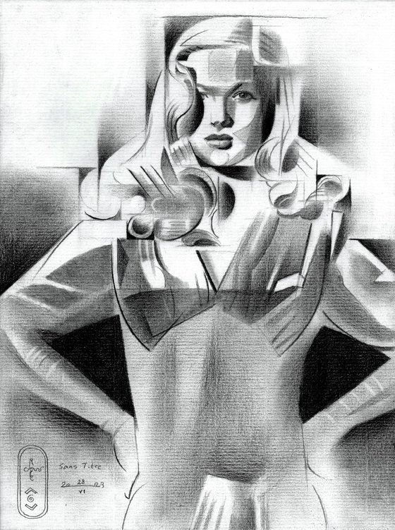
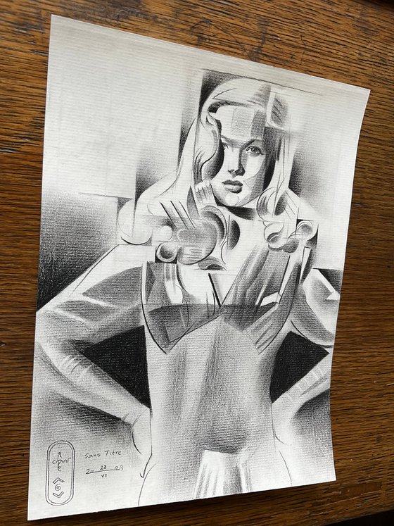
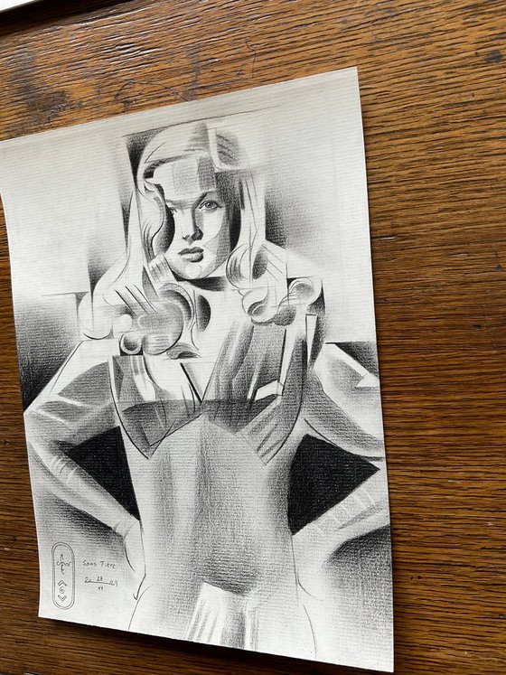
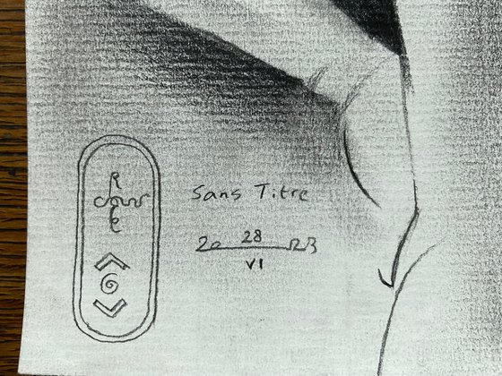
This graphite pencil drawing ‘Sans Titre – 28-06-23’ depicts moviestar Veronica Lake. After Roundism (Tribute to Anita Ekberg) – 22-06-23 I thought I’d do another celebrity. However, the sale of Louise Brooks – 11-10-22 also may be partially the cause. People search for their favorite stars and an artist without a nose for the commercial is a lousy artist. I’m not leaning towards business alone though. I’m also attracted to portraiture all of a sudden, not in the least because youtube blocked me recently. Once again, I may say because I forgot to select the 18+ box for the nude content. I went out of my head. Anglo-saksons amongst you, please explain this to me. Why is it that artistic nudity is banned whereas I get to see violent video game ads between videos?
Different Approach
Perhaps I disgress from the subject too much. All the more reasons to do another portrait and why not. This time Veronica was on my mind. I had this incredible photograph full of chiaroscuro play. Such hefty tonal differences, especially in and around her head. By now I guess you already know my love for tonal variations. Setting out the composition I changed my mind though. Somehow I didn’t want to go extremely dark as in the last drawing. I think I already showed many times before how far I can go from a tonal point of view. What if I try to keep a loose structure, opening up planes in order to let them communicate?
Open Discussion
Of late I have these discussions with students about the necessity of keeping an open structure. I often see the tendency amongst students to finish forms by tightly pack contour delineations. By that I meant to say they leave no room between two adjacent planes. Many times we discuss Cézanny whom practically everybody loves. He managed to keep it loose as well, offering his painting to us alomst like an open discussion. After all, who doesn’t like a conversation in which two challenge eachother and leave the other room to reply. This was my very intention with regard to this one. Not wordly but visually obviously. So what do you think?
Graphite pencil (Faber Castell Pitt Graphite Matt pencil 14B) drawing on Fabriano Ingres paper (21 x 29.7 x 0.1 cm)
Artist: Corné Akkers
Materials used:
Pitt Graphite Matt pencil (Faber-Castell) drawing on Fabriano Ingres paper (21 x 28.2 x 0.1 cm)
Tags:
#female form #cubism #celebrity #art deco #veronica lakeSans Titre – 28-06-23 (2023) Pencil drawing
by Corné Akkers
8 Artist Reviews
£1,287.87
- Pencil drawing on Paper
- One of a kind artwork
- Size: 21 x 28.2 x 0.1cm (unframed) / 21 x 28.2cm (actual image size)
- Signed on the front
- Style: Geometric
- Subject: People and portraits
Loading
Original artwork description
Return to the Stars
This graphite pencil drawing ‘Sans Titre – 28-06-23’ depicts moviestar Veronica Lake. After Roundism (Tribute to Anita Ekberg) – 22-06-23 I thought I’d do another celebrity. However, the sale of Louise Brooks – 11-10-22 also may be partially the cause. People search for their favorite stars and an artist without a nose for the commercial is a lousy artist. I’m not leaning towards business alone though. I’m also attracted to portraiture all of a sudden, not in the least because youtube blocked me recently. Once again, I may say because I forgot to select the 18+ box for the nude content. I went out of my head. Anglo-saksons amongst you, please explain this to me. Why is it that artistic nudity is banned whereas I get to see violent video game ads between videos?
Different Approach
Perhaps I disgress from the subject too much. All the more reasons to do another portrait and why not. This time Veronica was on my mind. I had this incredible photograph full of chiaroscuro play. Such hefty tonal differences, especially in and around her head. By now I guess you already know my love for tonal variations. Setting out the composition I changed my mind though. Somehow I didn’t want to go extremely dark as in the last drawing. I think I already showed many times before how far I can go from a tonal point of view. What if I try to keep a loose structure, opening up planes in order to let them communicate?
Open Discussion
Of late I have these discussions with students about the necessity of keeping an open structure. I often see the tendency amongst students to finish forms by tightly pack contour delineations. By that I meant to say they leave no room between two adjacent planes. Many times we discuss Cézanny whom practically everybody loves. He managed to keep it loose as well, offering his painting to us alomst like an open discussion. After all, who doesn’t like a conversation in which two challenge eachother and leave the other room to reply. This was my very intention with regard to this one. Not wordly but visually obviously. So what do you think?
Graphite pencil (Faber Castell Pitt Graphite Matt pencil 14B) drawing on Fabriano Ingres paper (21 x 29.7 x 0.1 cm)
Artist: Corné Akkers
Materials used:
Pitt Graphite Matt pencil (Faber-Castell) drawing on Fabriano Ingres paper (21 x 28.2 x 0.1 cm)
Tags:
#female form #cubism #celebrity #art deco #veronica lake14 day money back guaranteeLearn more
