- By medium
- By subject
- By budget
- Sales
- Gift cards
- Discover all art
- Artists
- Editors’ picks
- Ideas
Original artwork description:
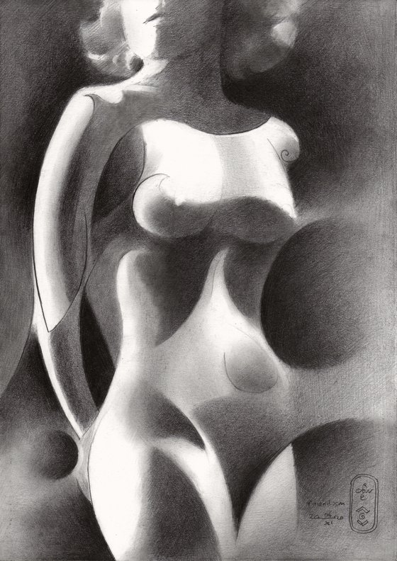
Roundism – 06-11-20
The Next One
After Roundism – 27-10-20 I thought to postpone future colored pencil drawings for a while and return to graphite pencil. I kind of like changing from color to monochrome and I am convinced it is the right rhythym for me. Maybe it is because such a change keeps me alert and keep me from delving into the realm of color too much. Furthermore, color easily can lead to inflation or unwanted repetition, getting me confused in the myriad of color relations. Taking up monochrome is like practising fingerings and scales to pianists. There is nothing that beats a sound feeling for tonal values.
Sand Vibration Patterns
A couple of days ago I saw a guy making sand vibration patterns on Instagram and I was fascinated by the interference patterns created by sounds and vibrations caused by rubbing the edge of the metal plate the sand was on. It reminded me to what I did in a graphite pencil drawing like Roundism – 02-05-17. Why not return to a great idea in the past, dust it off and try this idea out once more? Therefor the goal was to create a feel of soft sandy transitions, variated by hefty abrupt tonal ones.
Art Deco
The reference picture I used was the reason for this, since it contained a lot of razorlight from above and the sides. It may be from the 1930s, looking at the hairdo and the chiaroscuro settings. Whenever I do not find the right reference picture from my own library of model pictures I took throughout the years, pre-W.W. II-artistic photographs always will come to my aid. With a little help from my old friends.
Graphite pencil drawing (Sakura 0.5 mm, Pentel 4B) on Winsor & Newton Bristol paper (21 x 29.7 x 0.1 cm) - A4 format)
Artist: Corné Akkers
Materials used:
Graphite pencil drawing (Sakura 0.5 mm, 4B) on Winsor & Newton Bristol paper (21 x 29.7 cm - A4 format)
Tags:
#cubism #akkers #roundism #corne #clairobscurRoundism – 06-11-20 (2020) Pencil drawing
by Corné Akkers
8 Artist Reviews
£1,287.87
- Pencil drawing on Paper
- One of a kind artwork
- Size: 21 x 29.7 x 0.1cm (unframed) / 21 x 29.7cm (actual image size)
- Signed on the front
- Style: Geometric
- Subject: Nudes and erotic
Loading
Original artwork description
Roundism – 06-11-20
The Next One
After Roundism – 27-10-20 I thought to postpone future colored pencil drawings for a while and return to graphite pencil. I kind of like changing from color to monochrome and I am convinced it is the right rhythym for me. Maybe it is because such a change keeps me alert and keep me from delving into the realm of color too much. Furthermore, color easily can lead to inflation or unwanted repetition, getting me confused in the myriad of color relations. Taking up monochrome is like practising fingerings and scales to pianists. There is nothing that beats a sound feeling for tonal values.
Sand Vibration Patterns
A couple of days ago I saw a guy making sand vibration patterns on Instagram and I was fascinated by the interference patterns created by sounds and vibrations caused by rubbing the edge of the metal plate the sand was on. It reminded me to what I did in a graphite pencil drawing like Roundism – 02-05-17. Why not return to a great idea in the past, dust it off and try this idea out once more? Therefor the goal was to create a feel of soft sandy transitions, variated by hefty abrupt tonal ones.
Art Deco
The reference picture I used was the reason for this, since it contained a lot of razorlight from above and the sides. It may be from the 1930s, looking at the hairdo and the chiaroscuro settings. Whenever I do not find the right reference picture from my own library of model pictures I took throughout the years, pre-W.W. II-artistic photographs always will come to my aid. With a little help from my old friends.
Graphite pencil drawing (Sakura 0.5 mm, Pentel 4B) on Winsor & Newton Bristol paper (21 x 29.7 x 0.1 cm) - A4 format)
Artist: Corné Akkers
Materials used:
Graphite pencil drawing (Sakura 0.5 mm, 4B) on Winsor & Newton Bristol paper (21 x 29.7 cm - A4 format)
Tags:
#cubism #akkers #roundism #corne #clairobscur14 day money back guaranteeLearn more

