- By medium
- By subject
- By budget
- Sales
- Gift cards
- Discover all art
- Artists
- Editors’ picks
- Ideas
Original artwork description:
Slender Body
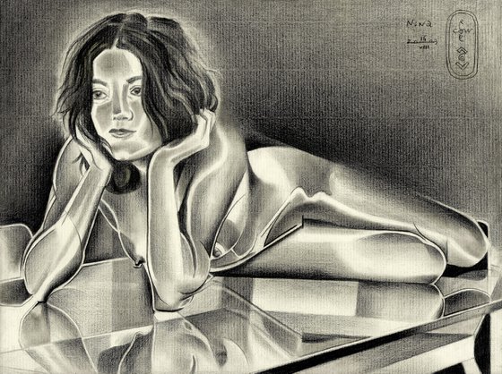
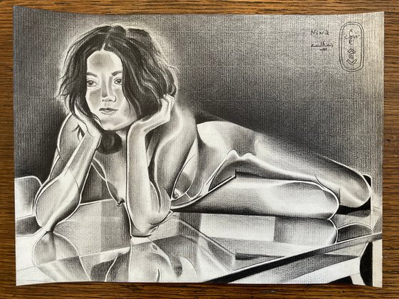
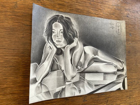
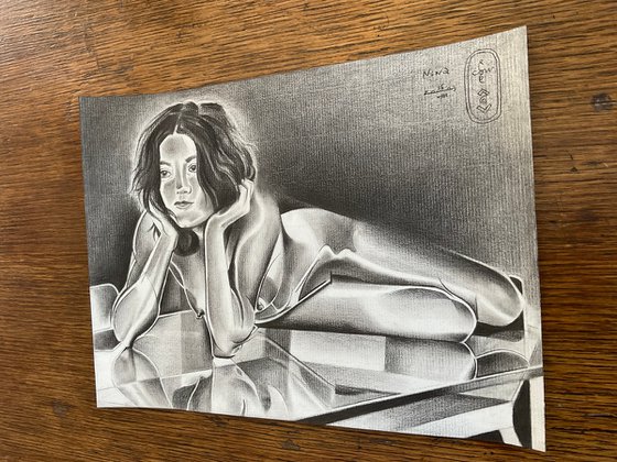
This graphite pencil drawing ‘Nina – 16-08-23’ is the second I made of this beautiful model. Her portrait I drew a week ago and I fancied doing another one. Her slender body offers me a new perspective on artistic forms I can draw from the female form. For those who missed out on her links: visit her website or profile on deviantart: ‘NinaErotique’. It’s like every model has her signature pattern designs. Obviously, that makes every woman unique. Both straight and round forms combined I saw this time. Next to these I depicted her on a glass table in the nude. I’d say, enough challenges to face and find solutions for.
Tonal Troubles
Unlike ‘Neo Deco – 02-08-23’ and my last oil ‘Neo Deco – 10-08-23’ there weren’t many tonal differences to hold on to. This has got nothing to do with her fair skin tone. That’s because even people with pale ones can show a full array of values. It was all about the subdued lighting in the scenery. That’s where I knew I had to come up with a dramatic solution in the form of ‘solarization’ once more. Frankly, I was also curious how my solarized concepts would look like on Ingres paper. Hitherto I made them on Bristol paper only due to smooth transitional possibilities.
Powerlines
Soon I found out I had to rub a lot of planes out with a stumper. Otherwise they would have looked too crumbly. That’s what Ingres paper allows and can do. Primarily it’s suitable for impressionist themes, I think. But hey, I never back down from a challenge. I came up with the solution to enforce linear structures and made them thicker and darker. Some might call them ‘power lines’. They strengthen the overall composition I think. They offer structure and thus guide the viewer through the artwork. I made sure I also let her body flow into the negative space as well. Otherwise the positive form of the body would have appeared too separated from the negative space. Not her hair though! I erased the light paper back around it and by that a sort of halo emerged, enhancing her angelic face.
Metallic Look
All in all, the result is a kind of metallic look. It reminds me to ‘A Metallurgical Approach to Bettie Page – 12-03-17’. Solarisation also creates lovely new forms. Hence, this style is also associated with surrealism. In particular I like the snake-like light patterns on her limbs.
Nipple-Policy
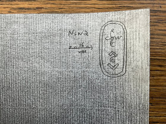
Last but not least, I skipped a lot of details in the background. There was this painting with a couple of abstracts forms. Incorporating them would have been too much of a good thing. Instead I placed my monogram and title there. Glass table reflections in the low part of the drawing prevented me from placing them there anyway. What I didn’t leave out were her nipples. I proclaim: they serve as beacons of sexual liberty. Not even sexuality for sure. They also represent true aesthetic beauty. Let everybody rejecting (artistic) nudity think twice before picking on them online. Do you think carrying a gun or playing violent video games is a cute thing? That’s why you only like safe paintings of dogs, horses and cats? I’m looking forward to the first hateful comments though. That makes me an artist on a mission with a wink. Blink or honk if you agree.
Graphite pencil (Faber Castell Pitt Graphite Matt pencil 14B) drawing on Fabriano Ingres paper (21 x 29.7 x 0.1 cm)
Artist: Corné Akkers
Materials used:
Graphite pencil (Faber Castell Pitt Graphite Matt pencil 14B) drawing Talens Bristol paper (21 x 29.7 x 0.1 cm)
Tags:
#female form #cubism #graphite #art deco #artistic nudeNina – 16-08-23 (2023) Pencil drawing
by Corné Akkers
8 Artist Reviews
£1,283.55
- Pencil drawing on Paper
- One of a kind artwork
- Size: 28.2 x 21 x 0.1cm (unframed) / 28.2 x 21cm (actual image size)
- Signed on the front
- Style: Geometric
- Subject: Nudes and erotic
Loading
Original artwork description
Slender Body
This graphite pencil drawing ‘Nina – 16-08-23’ is the second I made of this beautiful model. Her portrait I drew a week ago and I fancied doing another one. Her slender body offers me a new perspective on artistic forms I can draw from the female form. For those who missed out on her links: visit her website or profile on deviantart: ‘NinaErotique’. It’s like every model has her signature pattern designs. Obviously, that makes every woman unique. Both straight and round forms combined I saw this time. Next to these I depicted her on a glass table in the nude. I’d say, enough challenges to face and find solutions for.
Tonal Troubles
Unlike ‘Neo Deco – 02-08-23’ and my last oil ‘Neo Deco – 10-08-23’ there weren’t many tonal differences to hold on to. This has got nothing to do with her fair skin tone. That’s because even people with pale ones can show a full array of values. It was all about the subdued lighting in the scenery. That’s where I knew I had to come up with a dramatic solution in the form of ‘solarization’ once more. Frankly, I was also curious how my solarized concepts would look like on Ingres paper. Hitherto I made them on Bristol paper only due to smooth transitional possibilities.
Powerlines
Soon I found out I had to rub a lot of planes out with a stumper. Otherwise they would have looked too crumbly. That’s what Ingres paper allows and can do. Primarily it’s suitable for impressionist themes, I think. But hey, I never back down from a challenge. I came up with the solution to enforce linear structures and made them thicker and darker. Some might call them ‘power lines’. They strengthen the overall composition I think. They offer structure and thus guide the viewer through the artwork. I made sure I also let her body flow into the negative space as well. Otherwise the positive form of the body would have appeared too separated from the negative space. Not her hair though! I erased the light paper back around it and by that a sort of halo emerged, enhancing her angelic face.
Metallic Look
All in all, the result is a kind of metallic look. It reminds me to ‘A Metallurgical Approach to Bettie Page – 12-03-17’. Solarisation also creates lovely new forms. Hence, this style is also associated with surrealism. In particular I like the snake-like light patterns on her limbs.
Nipple-Policy
Last but not least, I skipped a lot of details in the background. There was this painting with a couple of abstracts forms. Incorporating them would have been too much of a good thing. Instead I placed my monogram and title there. Glass table reflections in the low part of the drawing prevented me from placing them there anyway. What I didn’t leave out were her nipples. I proclaim: they serve as beacons of sexual liberty. Not even sexuality for sure. They also represent true aesthetic beauty. Let everybody rejecting (artistic) nudity think twice before picking on them online. Do you think carrying a gun or playing violent video games is a cute thing? That’s why you only like safe paintings of dogs, horses and cats? I’m looking forward to the first hateful comments though. That makes me an artist on a mission with a wink. Blink or honk if you agree.
Graphite pencil (Faber Castell Pitt Graphite Matt pencil 14B) drawing on Fabriano Ingres paper (21 x 29.7 x 0.1 cm)
Artist: Corné Akkers
Materials used:
Graphite pencil (Faber Castell Pitt Graphite Matt pencil 14B) drawing Talens Bristol paper (21 x 29.7 x 0.1 cm)
Tags:
#female form #cubism #graphite #art deco #artistic nude14 day money back guaranteeLearn more
