- By medium
- By subject
- By budget
- Sales
- Gift cards
- Discover all art
- Artists
- Editors’ picks
- Ideas
Original artwork description:
Model Session - 16-10-20
Yesterday’s Model Session
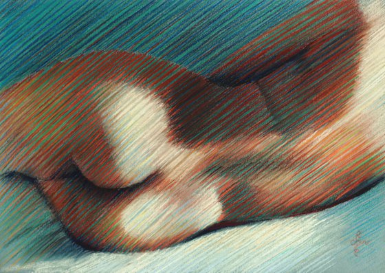
After my sketch of Louise Brooks – 10-10-20 I wanted to do more in my hatched strokes style. Yesterday’s model session offered me the opportunity again to draw with a live model in front of my eyes. Due to the razor lights I placed at the left and the right I got a great distribution of light and dark plains. Unfortunately much to the detriment of my view on her, I had to install some lighting on my paper. This morning I corrected the lighting and color saturation a lit because even artificial lighting cannot bring me what daylight offers.
Divisionism
Like in my pastel Model Session – 14-02-19 I was focused on the effect of divisionism in this drawing. As stated before, I have come to the conclusion that as such, pastel lacks color brilliance because basically a pastel drawing is just a pile of dust particles on paper, without an oily coating that gives that laminated look of oil paintings. I find many blended pastels look merky or as if someone has put a grey veil over them. For a long time I am quite fond of modernists like Signac, Toorop, Gestel and so many other who placed touches of color next to eachother in order to have the viewer assemble those touches as one and enjoy the greying result.
Reds and Greens
That is why I placed reddish and green strokes next to eachother. Of course I placed varieties of reds and greens (more yellowish ones) as well. I always like the result: it looks ‘crisp’ while on the other hand from a distance the exact right degree of unsaturation is achieved. Because of this effect I planned I only used a part of her body and therefor the stress lies not on some nifty anatomic representation.
Pastel drawing on Talens Toned Gray paper (29.7 x 24 x 0.1 cm)
Artist: Corné Akkers
Materials used:
Pastel drawing on Talens Toned Gray paper (29.7 x 24 x 0.1 cm)
Tags:
#nude #realism #impressionism #akkers #corneModel Session - 16-10-20 (2020) Pastel drawing
by Corné Akkers
8 Artist Reviews
£1,287.87
- Pastel drawing on Paper
- One of a kind artwork
- Size: 42 x 29.7 x 0.1cm (unframed) / 42 x 29.7cm (actual image size)
- Signed on the front
- Style: Impressionistic
- Subject: Nudes and erotic
Loading
Original artwork description
Model Session - 16-10-20
Yesterday’s Model Session
After my sketch of Louise Brooks – 10-10-20 I wanted to do more in my hatched strokes style. Yesterday’s model session offered me the opportunity again to draw with a live model in front of my eyes. Due to the razor lights I placed at the left and the right I got a great distribution of light and dark plains. Unfortunately much to the detriment of my view on her, I had to install some lighting on my paper. This morning I corrected the lighting and color saturation a lit because even artificial lighting cannot bring me what daylight offers.
Divisionism
Like in my pastel Model Session – 14-02-19 I was focused on the effect of divisionism in this drawing. As stated before, I have come to the conclusion that as such, pastel lacks color brilliance because basically a pastel drawing is just a pile of dust particles on paper, without an oily coating that gives that laminated look of oil paintings. I find many blended pastels look merky or as if someone has put a grey veil over them. For a long time I am quite fond of modernists like Signac, Toorop, Gestel and so many other who placed touches of color next to eachother in order to have the viewer assemble those touches as one and enjoy the greying result.
Reds and Greens
That is why I placed reddish and green strokes next to eachother. Of course I placed varieties of reds and greens (more yellowish ones) as well. I always like the result: it looks ‘crisp’ while on the other hand from a distance the exact right degree of unsaturation is achieved. Because of this effect I planned I only used a part of her body and therefor the stress lies not on some nifty anatomic representation.
Pastel drawing on Talens Toned Gray paper (29.7 x 24 x 0.1 cm)
Artist: Corné Akkers
Materials used:
Pastel drawing on Talens Toned Gray paper (29.7 x 24 x 0.1 cm)
Tags:
#nude #realism #impressionism #akkers #corne14 day money back guaranteeLearn more

