Main Navigation
Original artwork description:
The Sale of Louise
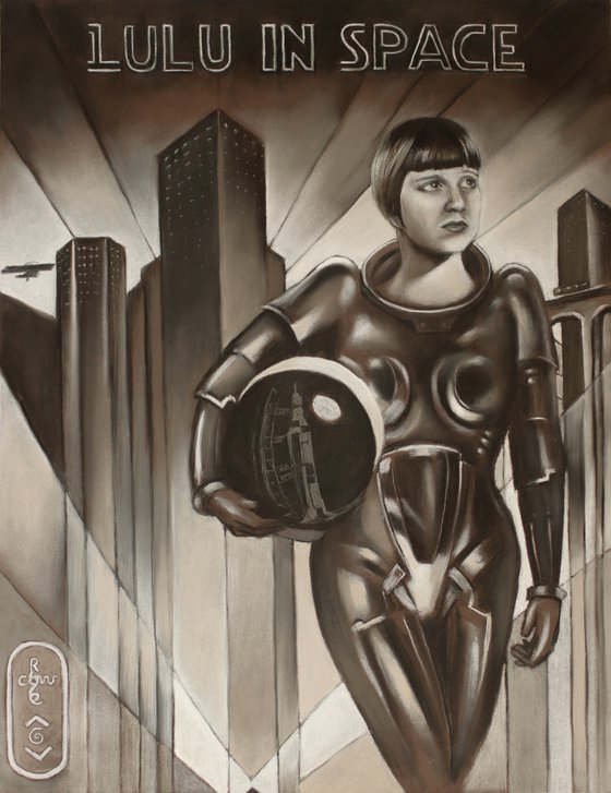
This pastel drawing ‘Lulu – 11-07-24’ depicts new adventurous endeavours celebrity moviestar Louise Brooks is about to undertake. Exit Metropolis! Let me explain how this came to be. Sometimes everything falls into place. Last Saturday I had an interested art collector come over to my studio in Voorburg. He bought my my oil painting Louise Brooks - 26-10-14 for which I am very grateful. Happy to know he appreciates my work and that he’ll take good care of her. It turned out he is an international lawyer too, just like me. We both know Frans van der Dunk who taught space law in Leiden. One thought led to another and I suggested to have Louise Brooks floating in space. After all, because of me Geesje Kwak floats around in space eternally.
Enter Metropolis
Back home I thought of Louise in the evening. What to do next? Somehow I felt reluctant to pull the same trick and put her in a tin can as well. Even though it’ll deliver a pretty pic-ture I already done that. Never repeat yourself. Fortunately the Universe answered my call and put visions of Metropolis in my mind. Perhaps you know it, made by Fritz Lang back in 1927. Lulu could have known that one. Then I also remembered the female robot Maria in a sexy shiny metal coating. Simply perfect as space jumpsuit for Ms Brooks, even though it’s only loosely based on the robot figure.
No Color
Next to this, no need to introduce color. Hence it also became a homage to the black and white movie itself. I kept the scenery rather sketchy just as the original poster. Instead I focused on her glance and shininess of the suit. However, some details I added later on like the train on the bridge. The funny aeroplane on the left looks very outdated to us now. It must have been very modern in the 1920s though. Last but not least, I drew the Apollo launching platform in the helmet. The font of the title in the upper part of the dra-wing is from Star Wars. The first attempt was in German using the original Metropolis glyphs. These turned to become bit too spiky and therefor too dominant though. I’ll bet this is the movie Fritz would have loved to make.
Pastel drawing on Canson Mi-Teintes (50 x 65 x 0.1 cm)
Artist: Corné Akkers
Materials used:
Pastel drawing on Canson Mi-Teintes (50 x 65 x 0.1 cm)
Tags:
#retro #vintage #art deco #1920s #louise brooksLulu in Space – 11-07-24 (2024) Pencil drawing
by Corné Akkers
8 Artist Reviews
£1,314.6
- Pencil drawing on Paper
- One of a kind artwork
- Size: 50 x 65 x 0.1cm (unframed) / 50 x 65cm (actual image size)
- Signed on the front
- Style: Surrealistic
- Subject: People and portraits
Loading
Original artwork description
The Sale of Louise
This pastel drawing ‘Lulu – 11-07-24’ depicts new adventurous endeavours celebrity moviestar Louise Brooks is about to undertake. Exit Metropolis! Let me explain how this came to be. Sometimes everything falls into place. Last Saturday I had an interested art collector come over to my studio in Voorburg. He bought my my oil painting Louise Brooks - 26-10-14 for which I am very grateful. Happy to know he appreciates my work and that he’ll take good care of her. It turned out he is an international lawyer too, just like me. We both know Frans van der Dunk who taught space law in Leiden. One thought led to another and I suggested to have Louise Brooks floating in space. After all, because of me Geesje Kwak floats around in space eternally.
Enter Metropolis
Back home I thought of Louise in the evening. What to do next? Somehow I felt reluctant to pull the same trick and put her in a tin can as well. Even though it’ll deliver a pretty pic-ture I already done that. Never repeat yourself. Fortunately the Universe answered my call and put visions of Metropolis in my mind. Perhaps you know it, made by Fritz Lang back in 1927. Lulu could have known that one. Then I also remembered the female robot Maria in a sexy shiny metal coating. Simply perfect as space jumpsuit for Ms Brooks, even though it’s only loosely based on the robot figure.
No Color
Next to this, no need to introduce color. Hence it also became a homage to the black and white movie itself. I kept the scenery rather sketchy just as the original poster. Instead I focused on her glance and shininess of the suit. However, some details I added later on like the train on the bridge. The funny aeroplane on the left looks very outdated to us now. It must have been very modern in the 1920s though. Last but not least, I drew the Apollo launching platform in the helmet. The font of the title in the upper part of the dra-wing is from Star Wars. The first attempt was in German using the original Metropolis glyphs. These turned to become bit too spiky and therefor too dominant though. I’ll bet this is the movie Fritz would have loved to make.
Pastel drawing on Canson Mi-Teintes (50 x 65 x 0.1 cm)
Artist: Corné Akkers
Materials used:
Pastel drawing on Canson Mi-Teintes (50 x 65 x 0.1 cm)
Tags:
#retro #vintage #art deco #1920s #louise brooks14 day money back guaranteeLearn more

