- By medium
- By subject
- By budget
- Sales
- Gift cards
- Discover all art
- Artists
- Editors’ picks
- Ideas
Original artwork description:
Colored Pencil
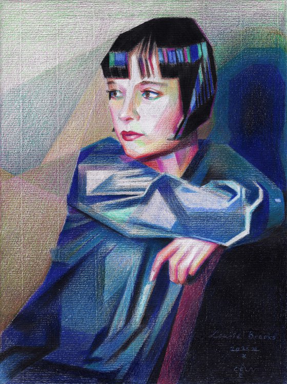
This colored pencil drawing ‘Louise Brooks – 21-10-22’ is something I wanted to do for a long time. My last drawing already bears a bit of colour like the one before that also depicting Louise. It was only at the beginning of this year that I used only colored pencils on paper. Naturally the reason was to see how colored pencil would react to Ingres paper. I’m always into new things because I like the uncertainty that comes with it. Surely this would scare off many but we artists need to be constantly challenged. It merely is a confession from my side. Doing the same thing consecutively in the same style can be reassuring for it optimalises the execution and diction. However, all things repetative in the long run turn into mannerism, even kitsch. Hence my turn to color this time!
Disasterous
In order to define colors I experimented with computer generated colorings. They didn’t fully convince, so I deviated from them. Instead, I bet on a save and sound color scheme. Blue is always nice for the color of attire. Certainly not warm because it would only wrongfully coincide with facial ones. I liked the rhythym of the blue, then warmish colors and blues again in the bob hair cut. I chose green for the negative space in order to have it complement reds and pinks in her facial features. Yesterday evening I threw in all colors, only to discover this morning the result looked disasterously saturated. That can happen with drawing under articial light. Next plan was to unsaturate colors and have them marry eachother.
The Final Result
What I discovered was that hatching over the blue with orange pencils gave me the result I needed. It almost felt like glazing as one does with oil paints. I did the same with red over green in the background. The hatching itself reminded me to my earlier divisionist strokes I often lay using pastel. It brought me color vibrancy, even though the combined result looked more grayish. Personally I think divisionism matches the way eyes registrate colors more than using grayed colors right away.
Colored pencil (Faber-Castell, Caran d’Ache, Prismacolor) drawing on Fabriano Ingres paper (28.2 x 21 x 0.1 cm)
Artist: Corné Akkers
Materials used:
Colored pencil (Faber-Castell, Caran d’Ache, Prismacolor) drawing on Fabriano Ingres paper (28.2 x 21 x 0.1 cm)
Tags:
#chiaroscuro #cubism #art deco #colored ligts #louise brooksLouise Brooks – 21-10-22 (sold) (2022) Pencil drawing
by Corné Akkers
8 Artist Reviews
£1,287.87 Sold
- Pencil drawing on Paper
- One of a kind artwork
- Size: 21 x 28.2 x 0.1cm (unframed) / 21 x 28.2cm (actual image size)
- Signed on the front
- Style: Geometric
- Subject: People and portraits
Loading
Original artwork description
Colored Pencil
This colored pencil drawing ‘Louise Brooks – 21-10-22’ is something I wanted to do for a long time. My last drawing already bears a bit of colour like the one before that also depicting Louise. It was only at the beginning of this year that I used only colored pencils on paper. Naturally the reason was to see how colored pencil would react to Ingres paper. I’m always into new things because I like the uncertainty that comes with it. Surely this would scare off many but we artists need to be constantly challenged. It merely is a confession from my side. Doing the same thing consecutively in the same style can be reassuring for it optimalises the execution and diction. However, all things repetative in the long run turn into mannerism, even kitsch. Hence my turn to color this time!
Disasterous
In order to define colors I experimented with computer generated colorings. They didn’t fully convince, so I deviated from them. Instead, I bet on a save and sound color scheme. Blue is always nice for the color of attire. Certainly not warm because it would only wrongfully coincide with facial ones. I liked the rhythym of the blue, then warmish colors and blues again in the bob hair cut. I chose green for the negative space in order to have it complement reds and pinks in her facial features. Yesterday evening I threw in all colors, only to discover this morning the result looked disasterously saturated. That can happen with drawing under articial light. Next plan was to unsaturate colors and have them marry eachother.
The Final Result
What I discovered was that hatching over the blue with orange pencils gave me the result I needed. It almost felt like glazing as one does with oil paints. I did the same with red over green in the background. The hatching itself reminded me to my earlier divisionist strokes I often lay using pastel. It brought me color vibrancy, even though the combined result looked more grayish. Personally I think divisionism matches the way eyes registrate colors more than using grayed colors right away.
Colored pencil (Faber-Castell, Caran d’Ache, Prismacolor) drawing on Fabriano Ingres paper (28.2 x 21 x 0.1 cm)
Artist: Corné Akkers
Materials used:
Colored pencil (Faber-Castell, Caran d’Ache, Prismacolor) drawing on Fabriano Ingres paper (28.2 x 21 x 0.1 cm)
Tags:
#chiaroscuro #cubism #art deco #colored ligts #louise brooks14 day money back guaranteeLearn more

