- By medium
- By subject
- By budget
- Sales
- Gift cards
- Discover all art
- Artists
- Editors’ picks
- Ideas
Original artwork description:
The Iridia and Arke series of paintings were evolved to give the viewer the time and space to enjoy the pure experience of seeing colour.
We can all appreciate colour as we see it around us. A flower, a sunset, a piece of clothing, but there’s often no time to deepen our feeling for colour.
These paintings can be a place to let the mind explore the experience colour. They also can also give a bit of a lift to a our day as we repeatedly pass by them. I know because I wall-test them myself. In dark times, some radiant colour can be very welcome.
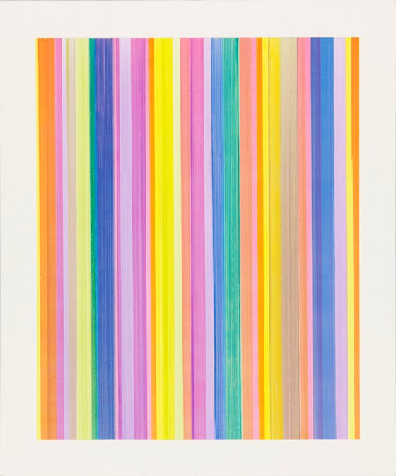
'Iridia 2' was a continuation of direction from 'Iridia 1'. It features again the improvisation, and the required reactiveness of painting left to right across the canvas with a different colour each time. I had decided to switch up the palette a bit and adjust the paint for more saturated colour. I was inspired by the joyousness I felt in my experience as a viewer, looking at the resulting painting.
The following text is common to each painting in the Iridia series.
The Iridia paintings are the result of a long development, using acrylic paint on canvas to achieve an original experience of colour for the viewer.
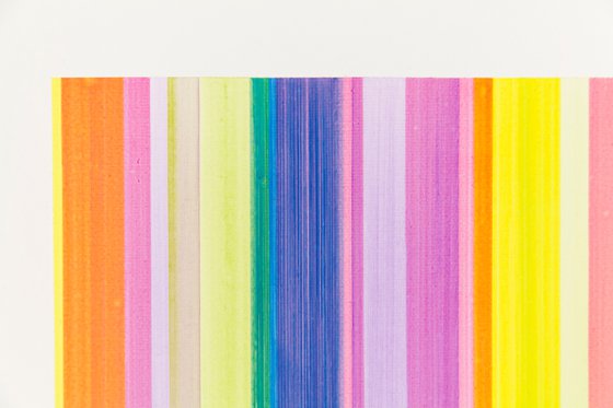
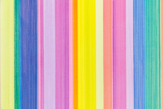
Repeated stripes allow for three or four colours to mix on the canvas, with a surprising range of results.
Every stripe is hand-painted over the previous colour, once it has dried. I use an adapted T square as a guide, to get the straightest stripes possible, but a distraction, or lack of focus, can lead to a fault which can ruin the whole painting and mean starting all over again. However, the process is a great opportunity to clear and still my mind and become lost in the evolving painting.
My search for the series name took me to Greek mythology, as it often does. The Goddess of the rainbow, the nearest visual equivalent to these paintings in the natural world, was called Iris, but I found that she had an assistant, called Iridia. Her name name gives us many words that describe effect of light on colour, and so her name seemed right for these works. I also liked that she helped Iris, and I hope that these paintings will help the viewer to enjoy colour more personally.
Form is not key here. The stripes are not supposed to suggest something from reality, though associations can of course happen. These paintings exist to invite the eye of the viewer to move between the colours, without attachment, making for a simple meditative effect.
These works could be described as Minimalist. They are not at the extreme end of that title, but they do seek to draw out the essence of something, (here it is the direct experience of colour for the viewer), while avoiding distraction.
Through all the Iridia and Arke paintings, the stripes can be laid out in one of three ways:
1. The earlier ones are basically an improvisation. Each colour is applied one at a time across the canvas, with the thought in mind of the colours to come and the space available to them.
2. Some stripes are applied in a sequence or pattern, from left to right, following a plan.
3. Some stripes are planned from the centre outwards, to make a more symmetrical layout.
I created a very modified paint formula, so that the colours are still vibrant, but also transparent and very thin. Light is not only reflected from the surface, but also passes through the paint and is bounced back out again by the white canvas or the colour beneath, adding to the richness.
I then put the finished painting on the wall in my house and live with it for a time. If it catches me each time I pass, or lets me enjoy the colours and lose myself for a little while, then I know that, for me, it has worked.
These are paintings for an intimate setting, where you can pass close to them, or be near them, throughout the day. Your distance and angle of view, and the lighting at each time of day can often bring out a new aspect of the colours.
If I’m feeling a little tired or frazzled, I’ve found these paintings raise my spirits, and it would be my greatest joy if other people experienced the same thing.
All Iridia and Arke paintings are ready to hang, as box canvases, with any hardware to be supplied by the buyer to suit their situation.
The paintings are shipped in a strong case, made from recycled wood products, which is sealed in a waterproof mailing envelope.
If the postal charges are less than anticipated, a refund will be made. Insurance is included, subject to destination, but is only available to cover loss of the item.
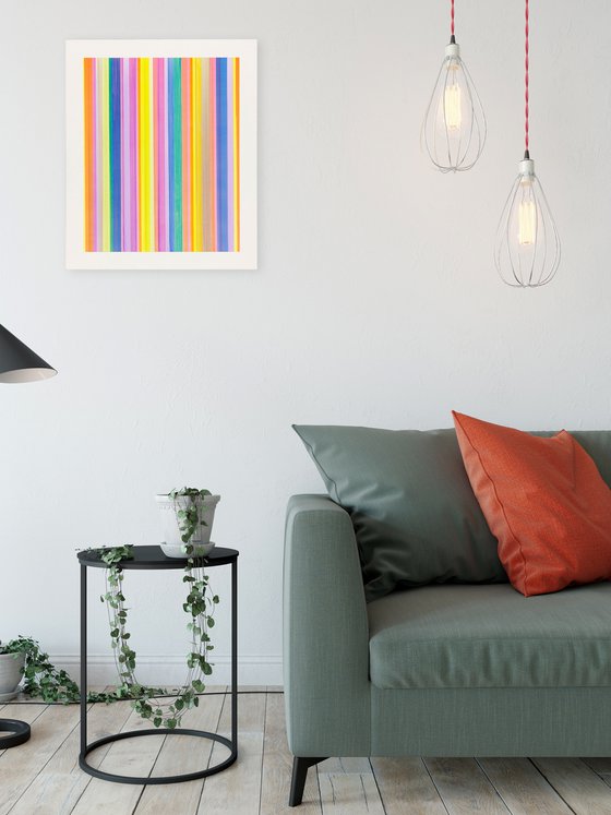
The image size represents the dimensions of the canvas, as the coloured area and the white surround are integral to the image.
The size of the painting in the room setting is only approximate. Please refer to the accurate measurements below.
Materials used:
Acrlic paint
Tags:
##joyous ##radiant #colourIridia 2 (2019) Acrylic painting
by Kevin Harper
£580
- Acrylic painting on Canvas
- One of a kind artwork
- Size: 50.8 x 60.7 x 3.9cm / 50.8 x 60.7cm (actual image size)
- Ready to hang
- Signed on the back
- Style: Geometric
- Subject: Abstract and non-figurative
Loading
Original artwork description
The Iridia and Arke series of paintings were evolved to give the viewer the time and space to enjoy the pure experience of seeing colour.
We can all appreciate colour as we see it around us. A flower, a sunset, a piece of clothing, but there’s often no time to deepen our feeling for colour.
These paintings can be a place to let the mind explore the experience colour. They also can also give a bit of a lift to a our day as we repeatedly pass by them. I know because I wall-test them myself. In dark times, some radiant colour can be very welcome.
'Iridia 2' was a continuation of direction from 'Iridia 1'. It features again the improvisation, and the required reactiveness of painting left to right across the canvas with a different colour each time. I had decided to switch up the palette a bit and adjust the paint for more saturated colour. I was inspired by the joyousness I felt in my experience as a viewer, looking at the resulting painting.
The following text is common to each painting in the Iridia series.
The Iridia paintings are the result of a long development, using acrylic paint on canvas to achieve an original experience of colour for the viewer.
Repeated stripes allow for three or four colours to mix on the canvas, with a surprising range of results.
Every stripe is hand-painted over the previous colour, once it has dried. I use an adapted T square as a guide, to get the straightest stripes possible, but a distraction, or lack of focus, can lead to a fault which can ruin the whole painting and mean starting all over again. However, the process is a great opportunity to clear and still my mind and become lost in the evolving painting.
My search for the series name took me to Greek mythology, as it often does. The Goddess of the rainbow, the nearest visual equivalent to these paintings in the natural world, was called Iris, but I found that she had an assistant, called Iridia. Her name name gives us many words that describe effect of light on colour, and so her name seemed right for these works. I also liked that she helped Iris, and I hope that these paintings will help the viewer to enjoy colour more personally.
Form is not key here. The stripes are not supposed to suggest something from reality, though associations can of course happen. These paintings exist to invite the eye of the viewer to move between the colours, without attachment, making for a simple meditative effect.
These works could be described as Minimalist. They are not at the extreme end of that title, but they do seek to draw out the essence of something, (here it is the direct experience of colour for the viewer), while avoiding distraction.
Through all the Iridia and Arke paintings, the stripes can be laid out in one of three ways:
1. The earlier ones are basically an improvisation. Each colour is applied one at a time across the canvas, with the thought in mind of the colours to come and the space available to them.
2. Some stripes are applied in a sequence or pattern, from left to right, following a plan.
3. Some stripes are planned from the centre outwards, to make a more symmetrical layout.
I created a very modified paint formula, so that the colours are still vibrant, but also transparent and very thin. Light is not only reflected from the surface, but also passes through the paint and is bounced back out again by the white canvas or the colour beneath, adding to the richness.
I then put the finished painting on the wall in my house and live with it for a time. If it catches me each time I pass, or lets me enjoy the colours and lose myself for a little while, then I know that, for me, it has worked.
These are paintings for an intimate setting, where you can pass close to them, or be near them, throughout the day. Your distance and angle of view, and the lighting at each time of day can often bring out a new aspect of the colours.
If I’m feeling a little tired or frazzled, I’ve found these paintings raise my spirits, and it would be my greatest joy if other people experienced the same thing.
All Iridia and Arke paintings are ready to hang, as box canvases, with any hardware to be supplied by the buyer to suit their situation.
The paintings are shipped in a strong case, made from recycled wood products, which is sealed in a waterproof mailing envelope.
If the postal charges are less than anticipated, a refund will be made. Insurance is included, subject to destination, but is only available to cover loss of the item.
The image size represents the dimensions of the canvas, as the coloured area and the white surround are integral to the image.
The size of the painting in the room setting is only approximate. Please refer to the accurate measurements below.
Materials used:
Acrlic paint
Tags:
##joyous ##radiant #colour14 day money back guaranteeLearn more


