- By medium
- By subject
- By budget
- Sales
- Gift cards
- Discover all art
- Artists
- Editors’ picks
- Ideas
Original artwork description:
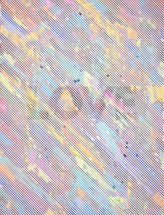
"I Weep For The Blind" is part of my white space series of works. It is an op-art based piece, that is slightly messy due to the concept, and changes in perspective that make the word "LOVE" appear and disappear depending on the distance from the piece.
As you may have noticed, I have been in the field of graphic design for many years now, and throughout this journey, you gain a knowledge and understanding about what is popular in design, and what helps contort the mind to seeing what you want it to see. For example, in advertisements every little detail from the size and hierarchy of the text, to the placement of graphics, to the implied nature of line work… It is all there for one person, to guide the viewer’s eyes and bring them into the ad. In the art world, this can be portrayed all the same. In my series, “White Space Designs,” I utilize placement of design elements, and popular culture references, to guide the viewer into the mind of a designer and what it means to utilize contrasting and complementary color palettes cohesively, to accent the basis and dramatic nature of the designs themselves, without complicating the entire image with a blast of color and design, the minimalistic nature of white balances the designs to allow energy to flow freely without overburdening the viewer’s optics.
Materials used:
Acrylic on raised wood panel
Tags:
#colorful #contemporary #modern #love #bright #vivid #vibrant #conceptual #rainbow #happiness #psychedelia #messyI Weep For The Blind (2016) Acrylic painting
by Sean Christopher Ward
6 Artist Reviews
£377.83 Sold
- Acrylic painting on Panel / Board / MDF
- One of a kind artwork
- Size: 45.72 x 60.96 x 2.54cm (unframed) / 45.72 x 60.96cm (actual image size)
- Ready to hang
- Signed on the back
- Style: Geometric
- Subject: Abstract and non-figurative
Do you like this artwork?
This artwork has sold, but the artist is accepting commission requests. Commissioning an artwork is easy and you get a perfectly personalised piece.
Loading
Original artwork description
"I Weep For The Blind" is part of my white space series of works. It is an op-art based piece, that is slightly messy due to the concept, and changes in perspective that make the word "LOVE" appear and disappear depending on the distance from the piece.
As you may have noticed, I have been in the field of graphic design for many years now, and throughout this journey, you gain a knowledge and understanding about what is popular in design, and what helps contort the mind to seeing what you want it to see. For example, in advertisements every little detail from the size and hierarchy of the text, to the placement of graphics, to the implied nature of line work… It is all there for one person, to guide the viewer’s eyes and bring them into the ad. In the art world, this can be portrayed all the same. In my series, “White Space Designs,” I utilize placement of design elements, and popular culture references, to guide the viewer into the mind of a designer and what it means to utilize contrasting and complementary color palettes cohesively, to accent the basis and dramatic nature of the designs themselves, without complicating the entire image with a blast of color and design, the minimalistic nature of white balances the designs to allow energy to flow freely without overburdening the viewer’s optics.
Materials used:
Acrylic on raised wood panel
Tags:
#colorful #contemporary #modern #love #bright #vivid #vibrant #conceptual #rainbow #happiness #psychedelia #messy14 day money back guaranteeLearn more

