- By medium
- By subject
- By budget
- Sales
- Gift cards
- Discover all art
- Artists
- Editors’ picks
- Ideas
Original artwork description:
Scaling up
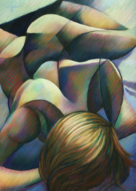
This pastel drawing Golden Lilac – 07-02-21 is based on a previous graphite pencil drawing ‘Nude – 13-01-16’. Once in a while I realize I draw in graphite more often than in pastel or oil. Obviously the first has become my weapon of choice and I always have a work in progress on paper. However, lately I felt the need to develop my skills in pastel and oil. Besides that, I also am curious to see what challenges I may face once a A4-size drawing is transfered to a bigger scale. As explained in the statement of my oil painting ‘The Restoration of Bettie Page – 01-04-20’ scaling up creates trouble. You can read about it when you click the link.
Color Challenge
Inasmuch the scaling problem did not cause the necessity to show more forms, it certainly created a color challenge. I had it in me to do a series in which gold and all varieties thereof play the leading role. Yellow as a dominant color I did not use very often in my works. Therefor it was time to dive into the realms of this dire color. I already explained my regular model of Indian descendance show this range of yellow golden hues, so why not? Scaling up forms was easy-peasy because I already invented the forms. Time for the continuation of a study of color relations.
Smincke Gold
After setting out the predefined forms I started to lay some patches of my Schmincke gold pastels. They looked great on the grey Pastelmat sheet but I felt I had to show more. In my pastel ‘Golden – 01-02-21’ I rubbed my fingertips sour until my thumbprint could not be recognized by my iPhone. This was not the only reason to skip the rubbin out for a while. I also wanted to show something different.
Balancing out
These patches I wanted to replace by hatched strokes maticulously grouped together so they match tonally and show soft gradients. And so this pastel became a piece wherein all colors (pinks, yellows, blues, greens and purples) are all balanced out. The yellow plains complement the purple ones. On a more subtle level the hatched green strokes are entwined with the red ones. This way they cancel their color saturation at a distance but tickle your eyes up close. It is a combinations of different techniques I employed in the past really. Pointillistic divisionism meets cubist styling.
Pastel drawing on Clairfontaine Pastel Mat paper (69.4 x 49.8 x 0.1 cm)
Artist: Corné Akkers
Materials used:
Pastel drawing on paper (49.8 x 69.7 x 0.1 cm)
Tags:
#pastel #yellow #cubism #artistic nude #roundismGolden Lilac - 07-02-21 (2021) Pastel drawing
by Corné Akkers
8 Artist Reviews
£1,283.55
- Pastel drawing on Paper
- One of a kind artwork
- Size: 49.8 x 69.4 x 0.1cm (unframed) / 49.8 x 69.4cm (actual image size)
- Signed on the front
- Style: Impressionistic
- Subject: Nudes and erotic
Loading
Original artwork description
Scaling up
This pastel drawing Golden Lilac – 07-02-21 is based on a previous graphite pencil drawing ‘Nude – 13-01-16’. Once in a while I realize I draw in graphite more often than in pastel or oil. Obviously the first has become my weapon of choice and I always have a work in progress on paper. However, lately I felt the need to develop my skills in pastel and oil. Besides that, I also am curious to see what challenges I may face once a A4-size drawing is transfered to a bigger scale. As explained in the statement of my oil painting ‘The Restoration of Bettie Page – 01-04-20’ scaling up creates trouble. You can read about it when you click the link.
Color Challenge
Inasmuch the scaling problem did not cause the necessity to show more forms, it certainly created a color challenge. I had it in me to do a series in which gold and all varieties thereof play the leading role. Yellow as a dominant color I did not use very often in my works. Therefor it was time to dive into the realms of this dire color. I already explained my regular model of Indian descendance show this range of yellow golden hues, so why not? Scaling up forms was easy-peasy because I already invented the forms. Time for the continuation of a study of color relations.
Smincke Gold
After setting out the predefined forms I started to lay some patches of my Schmincke gold pastels. They looked great on the grey Pastelmat sheet but I felt I had to show more. In my pastel ‘Golden – 01-02-21’ I rubbed my fingertips sour until my thumbprint could not be recognized by my iPhone. This was not the only reason to skip the rubbin out for a while. I also wanted to show something different.
Balancing out
These patches I wanted to replace by hatched strokes maticulously grouped together so they match tonally and show soft gradients. And so this pastel became a piece wherein all colors (pinks, yellows, blues, greens and purples) are all balanced out. The yellow plains complement the purple ones. On a more subtle level the hatched green strokes are entwined with the red ones. This way they cancel their color saturation at a distance but tickle your eyes up close. It is a combinations of different techniques I employed in the past really. Pointillistic divisionism meets cubist styling.
Pastel drawing on Clairfontaine Pastel Mat paper (69.4 x 49.8 x 0.1 cm)
Artist: Corné Akkers
Materials used:
Pastel drawing on paper (49.8 x 69.7 x 0.1 cm)
Tags:
#pastel #yellow #cubism #artistic nude #roundism14 day money back guaranteeLearn more

