- By medium
- By subject
- By budget
- Sales
- Gift cards
- Discover all art
- Artists
- Editors’ picks
- Ideas
Original artwork description:
Golden - 01-02-21
One Color is No Color
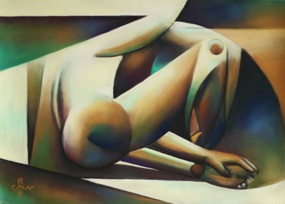
This pastel is in line with my previous pastel drawing ‘Golden – 28-01-21’ but that one looks rather monochrome. Time it was to add some more colors and define relations between them. After all, that is what color is all about. One color is no color. Two colors show relations. One says something about the other and the other way round. Three colors define nine relations and so forth. The more color the more complex a work of art can be, almost to the unbearable.
Colors and Saturation
The initial goal was to start with the yellows and brownish oranges and see what might turn up. I soon discovered that these colors and a wide tonal bandwidth only brought me something similar as my latest. Therefor I introduced some greens and blues. They brought some relief but I still needed a couple of purples in order to balance the yellow more radically. Thereafter I played around with different degrees of color saturation. Albeit colorful in essence, real saturated colors are scarce in this pastel drawing. These easily can lead to inflation and consequently to a screaming depiction causing tired eyes. That is why I used a lot of yellow but the areas are very light and thus less saturated. The drawing does not seem to match the title but in fact I used gold pastel patches a lot in this one. Perhaps they show more in the video.
The Result
Even though I am the creator I still find it fascinating what the final result is. It turns out to satisfy my expectations to some extent but also surprises me. The atmosphere and the feel is totally different from the original graphite pencil drawing Roundism -26-10-19. This having said, I like the color balance I achieved and that is what I set out to gain.
Pastel drawing on Clairfontaine Pastel Mat paper (69.4 x 49.8 x 0.1 cm)
Artist: Corné Akkers
Materials used:
Pastel drawing on paper (49.5 x 64.7 x 0.1 cm)
Tags:
#pastel #yellow #cubism #artistic nude #roundismGolden - 01-02-21 (2021) Pastel drawing
by Corné Akkers
8 Artist Reviews
£1,283.55
- Pastel drawing on Paper
- One of a kind artwork
- Size: 69.4 x 49.8 x 0.1cm (unframed) / 69.4 x 49.8cm (actual image size)
- Signed on the front
- Style: Impressionistic
- Subject: Nudes and erotic
Loading
Original artwork description
Golden - 01-02-21
One Color is No Color
This pastel is in line with my previous pastel drawing ‘Golden – 28-01-21’ but that one looks rather monochrome. Time it was to add some more colors and define relations between them. After all, that is what color is all about. One color is no color. Two colors show relations. One says something about the other and the other way round. Three colors define nine relations and so forth. The more color the more complex a work of art can be, almost to the unbearable.
Colors and Saturation
The initial goal was to start with the yellows and brownish oranges and see what might turn up. I soon discovered that these colors and a wide tonal bandwidth only brought me something similar as my latest. Therefor I introduced some greens and blues. They brought some relief but I still needed a couple of purples in order to balance the yellow more radically. Thereafter I played around with different degrees of color saturation. Albeit colorful in essence, real saturated colors are scarce in this pastel drawing. These easily can lead to inflation and consequently to a screaming depiction causing tired eyes. That is why I used a lot of yellow but the areas are very light and thus less saturated. The drawing does not seem to match the title but in fact I used gold pastel patches a lot in this one. Perhaps they show more in the video.
The Result
Even though I am the creator I still find it fascinating what the final result is. It turns out to satisfy my expectations to some extent but also surprises me. The atmosphere and the feel is totally different from the original graphite pencil drawing Roundism -26-10-19. This having said, I like the color balance I achieved and that is what I set out to gain.
Pastel drawing on Clairfontaine Pastel Mat paper (69.4 x 49.8 x 0.1 cm)
Artist: Corné Akkers
Materials used:
Pastel drawing on paper (49.5 x 64.7 x 0.1 cm)
Tags:
#pastel #yellow #cubism #artistic nude #roundism14 day money back guaranteeLearn more

