- By medium
- By subject
- By budget
- Sales
- Gift cards
- Discover all art
- Artists
- Editors’ picks
- Ideas
Original artwork description:
What’s Next?
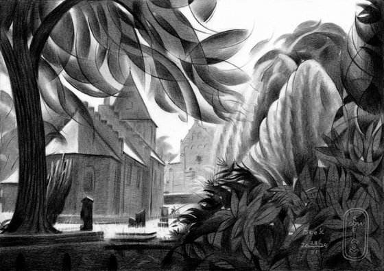
This graphite pencil drawing ‘Beek – 26-06-24’ is a carefully combined and planned mixture of impressionism and cubism. What do you think of it? Let me put down some words in order to explain what my goal was. In the recent past I did a lot of quick impressionist sketches on A6 and A5 size paper. Last one was ‘Hortus Botanicus – 26-05-24’. Then I worked with full force to complete my oil painting ‘Venus Lamenting – 14-06-24’. After that I didn’t feel like sketching and painting for an instance. There was enough work to do with regard to website maintenance. Sometimes I envie people like Van Gogh and Cézanne who didn’t had to do their own marketing. Anyway, after a week I got into the mood of creating again. However, I asked myself whether I wanted to go back to sketching on small format paper or not.
Combination of Impressionism & Cubism
Maybe do another A4 size landscape like so many in the past. Then I remembered the fun of making ‘Estate Oosterbeek – 31-03-20 (Sold)’. That one I found to be a succesful combination of realist, impressionist and cubist elements. Next to this I also had this wonderful scenery in mind. Located in one of my favorite places to be: Beek-Ubbergen, Gelderland, Netherlands. In the center there is this charming little church called the ‘Bartholomeuskerkje’ I drew back in 2020. On one of my frequent trips to the place I came across it once again. Suddenly I was caught by a glimpse into the St. Bartholomaeuskerk situated behind the smaller church. The very spot had it all: plenty of leaves, architectural structures. Also a great division between light and dark.
Abstraction of the Foliage
Aforementioned Oosterbeek drawing popped into my mind without any effort really. More a hunch that entered my mind actually. These things happens. Variation is the spice of life and this time also the balance between styles came naturally. The stress lies on the abstraction of the foliage. The tree in the left and the plants in the lower right corner blocked in the churches quite nicely. The churches are a bit realistic though so both styles can be interpreted from your own point of view. That is to say: the realism make the abstracted plants and trees plausible. Do you agree?
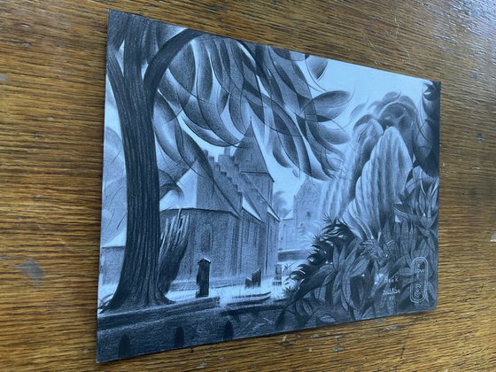
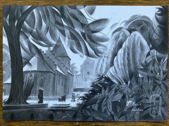
Pitt Graphite Matt pencil (Faber-Castell, 14B) drawing on Canson Bristol paper (21 x 29,7 x 0.1 cm)
Artist: Corné Akkers
Materials used:
Pitt Graphite Matt pencil (Faber-Castell, 14B) drawing on Canson Bristol paper (21 x 29,7 x 0.1 cm)
Tags:
#impressionism #cubism #graphite #treescape #roundismBeek – 23-06-24 (2024) Pencil drawing
by Corné Akkers
8 Artist Reviews
£1,254.98
- Pencil drawing on Paper
- One of a kind artwork
- Size: 29.7 x 21 x 0.1cm (unframed) / 29.7 x 21cm (actual image size)
- Signed on the front
- Style: Geometric
- Subject: Landscapes, sea and sky
Loading
Original artwork description
What’s Next?
This graphite pencil drawing ‘Beek – 26-06-24’ is a carefully combined and planned mixture of impressionism and cubism. What do you think of it? Let me put down some words in order to explain what my goal was. In the recent past I did a lot of quick impressionist sketches on A6 and A5 size paper. Last one was ‘Hortus Botanicus – 26-05-24’. Then I worked with full force to complete my oil painting ‘Venus Lamenting – 14-06-24’. After that I didn’t feel like sketching and painting for an instance. There was enough work to do with regard to website maintenance. Sometimes I envie people like Van Gogh and Cézanne who didn’t had to do their own marketing. Anyway, after a week I got into the mood of creating again. However, I asked myself whether I wanted to go back to sketching on small format paper or not.
Combination of Impressionism & Cubism
Maybe do another A4 size landscape like so many in the past. Then I remembered the fun of making ‘Estate Oosterbeek – 31-03-20 (Sold)’. That one I found to be a succesful combination of realist, impressionist and cubist elements. Next to this I also had this wonderful scenery in mind. Located in one of my favorite places to be: Beek-Ubbergen, Gelderland, Netherlands. In the center there is this charming little church called the ‘Bartholomeuskerkje’ I drew back in 2020. On one of my frequent trips to the place I came across it once again. Suddenly I was caught by a glimpse into the St. Bartholomaeuskerk situated behind the smaller church. The very spot had it all: plenty of leaves, architectural structures. Also a great division between light and dark.
Abstraction of the Foliage
Aforementioned Oosterbeek drawing popped into my mind without any effort really. More a hunch that entered my mind actually. These things happens. Variation is the spice of life and this time also the balance between styles came naturally. The stress lies on the abstraction of the foliage. The tree in the left and the plants in the lower right corner blocked in the churches quite nicely. The churches are a bit realistic though so both styles can be interpreted from your own point of view. That is to say: the realism make the abstracted plants and trees plausible. Do you agree?
Pitt Graphite Matt pencil (Faber-Castell, 14B) drawing on Canson Bristol paper (21 x 29,7 x 0.1 cm)
Artist: Corné Akkers
Materials used:
Pitt Graphite Matt pencil (Faber-Castell, 14B) drawing on Canson Bristol paper (21 x 29,7 x 0.1 cm)
Tags:
#impressionism #cubism #graphite #treescape #roundism14 day money back guaranteeLearn more
Artist Reviews (8)

Corné Akkers
Netherlands
About
Born in 1969 at Nijmegen. Corné's work can be seen in many countries all over the world.
Corné employs a variety of styles that all have one thing in common:... Read more