- By medium
- By subject
- By budget
- Sales
- Gift cards
- Discover all art
- Artists
- Editors’ picks
- Ideas
Original artwork description:
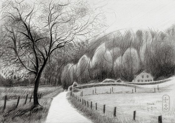
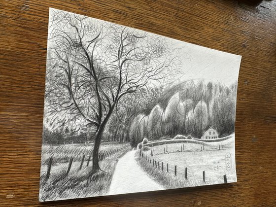
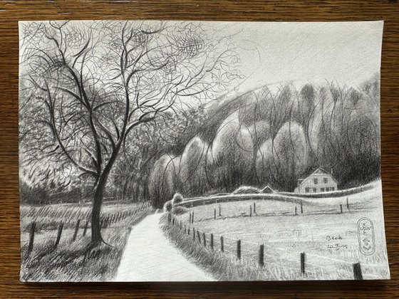
Natte Beek
This graphite pencil drawing ‘Beek – 14-04-25’ depicts a slighty cubist interpretation of an eponymous landscape. There’s this house called the ‘Natte Beek’ (‘Wet Rivulet’) which is funny. All rivulets, creeks or waters in general are wet, aren’t they? This actual spot is very well known to locals because it is a striking scenery. When you pass it via the Rijksstraatweg you’ll easily spot it. That’s because it is situated in an open field in the bushy hills of Beek. Many times I have seen it with childish curiosity sitting in a bus towards my grandmother in the Ooij. Especially in winter it looks like a gothic fairytale, looking forelorn in the woods. In summer it looks less threatening when meadows are all green. Spring has arrived and my outdoors sketching inclinations are growing. Therefor I thought it would be a good start using this spot as artistic motif.
Paper Strucure
Quite a while now since I made a last landscape really. My last one of Beek showed the old and the new Bartholomeuskerk in a cubistic approach. This time I had it in me to combine impressionism with cubism. This feeling appeared to exactly match the presupposition I had with regard to this Hahnemühle Bamboo sketch paper. Rather grainy of structure reacting to my pencil made me think of Ingres paper of the same brand. It happened to be that my soft 14B pencil scratched across the paper like a knife cuts through soft butter. Even rubbed out with a stump the structures still looked broken and open. Very likeable indeed I must say even though a bit too grainy without using a stump.
Slightly Cubistic
The goal was to implement cubist styling only subtlely. The treeline in the back for example is drawn more abstractly than it lets on initially. The hedge in front of the house has a split halfway. A deliberate addition from my part according to the principle of singularity. The tree in the front to the left was nothing but fun to draw. Very rewarding and satisfying to erase this dots of blossoms with a electric eraser. Even the little branches in the top are a bit abstracted. However, I think the overall scene looks more impressionistic and that was my very aim.
Pitt Graphite Matt pencil (Faber-Castell, 14B) drawing on Hahnemühle Bamboo Sketch paper (21 x 29,7 x 0.1 cm)
Artist: Corné Akkers
Materials used:
Pitt Graphite Matt pencil (Faber-Castell, 14B) drawing on Hahnemühle Bamboo Sketch paper (21 x 29,7 x 0.1 cm)
Tags:
#landscape #forest #impressionism #cubism #beek-ubbergenBeek - 14-04-25 (2025) Pencil drawing
by Corné Akkers
8 Artist Reviews
£1,283.55
- Pencil drawing on Paper
- One of a kind artwork
- Size: 29.7 x 21 x 0.1cm (unframed) / 29.7 x 21cm (actual image size)
- Signed on the front
- Style: Impressionistic
- Subject: Landscapes, sea and sky
Loading
Original artwork description
Natte Beek
This graphite pencil drawing ‘Beek – 14-04-25’ depicts a slighty cubist interpretation of an eponymous landscape. There’s this house called the ‘Natte Beek’ (‘Wet Rivulet’) which is funny. All rivulets, creeks or waters in general are wet, aren’t they? This actual spot is very well known to locals because it is a striking scenery. When you pass it via the Rijksstraatweg you’ll easily spot it. That’s because it is situated in an open field in the bushy hills of Beek. Many times I have seen it with childish curiosity sitting in a bus towards my grandmother in the Ooij. Especially in winter it looks like a gothic fairytale, looking forelorn in the woods. In summer it looks less threatening when meadows are all green. Spring has arrived and my outdoors sketching inclinations are growing. Therefor I thought it would be a good start using this spot as artistic motif.
Paper Strucure
Quite a while now since I made a last landscape really. My last one of Beek showed the old and the new Bartholomeuskerk in a cubistic approach. This time I had it in me to combine impressionism with cubism. This feeling appeared to exactly match the presupposition I had with regard to this Hahnemühle Bamboo sketch paper. Rather grainy of structure reacting to my pencil made me think of Ingres paper of the same brand. It happened to be that my soft 14B pencil scratched across the paper like a knife cuts through soft butter. Even rubbed out with a stump the structures still looked broken and open. Very likeable indeed I must say even though a bit too grainy without using a stump.
Slightly Cubistic
The goal was to implement cubist styling only subtlely. The treeline in the back for example is drawn more abstractly than it lets on initially. The hedge in front of the house has a split halfway. A deliberate addition from my part according to the principle of singularity. The tree in the front to the left was nothing but fun to draw. Very rewarding and satisfying to erase this dots of blossoms with a electric eraser. Even the little branches in the top are a bit abstracted. However, I think the overall scene looks more impressionistic and that was my very aim.
Pitt Graphite Matt pencil (Faber-Castell, 14B) drawing on Hahnemühle Bamboo Sketch paper (21 x 29,7 x 0.1 cm)
Artist: Corné Akkers
Materials used:
Pitt Graphite Matt pencil (Faber-Castell, 14B) drawing on Hahnemühle Bamboo Sketch paper (21 x 29,7 x 0.1 cm)
Tags:
#landscape #forest #impressionism #cubism #beek-ubbergen14 day money back guaranteeLearn more
Artist Reviews (8)

Corné Akkers
Netherlands
About
Born in 1969 at Nijmegen. Corné's work can be seen in many countries all over the world.
Corné employs a variety of styles that all have one thing in common:... Read more