- By medium
- By subject
- By budget
- Sales
- Gift cards
- Discover all art
- Artists
- Editors’ picks
- Ideas
Original artwork description:
Rather Curvy
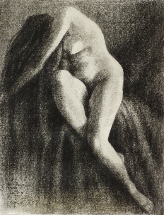
Graphite Pencil drawing ‘Art Deco Nude 29-08-22’ is the next one in line after ‘Sienna – 25-08-22’. The model for that one was great but also a bit slender. The bended knee almost seemed a bit off, even though I already made it a bit less volumnous. In general I like slender models because they show sound and clear anatomy of body parts. Models with too much overweight can look a bit amorphous sometimes. Not unlike the next model I used although she looked rather curvy. Lucky me!
Darkest One to Date
The reference photo I used is from the 1920s I think. It could be earlier though. I look it up in google images but to no avail. No matches, so I can’t give credits for the beautiful composition and use of light and dark. The sheets around her body were very dark so I made some clearer contour delineations in those ones. On the other hand they made the highlights and even the midtones popping out of her body. Therefor, my drawing is a bit tuned down. However, it is one of the darkest drawings I made in these series. Art Deco immediately came to mind, again! I guess that could be total nonsense. Why is it that I think of this style when I gaze at these kind of pictures from the 1920s and 1930s? Because of the era?
Style Naming
I guess I am still struggling to give these drawings a suitable name for the sake of namegiving. These days an artist has to write art statements so his viewers can see what he or she’s up to. Not that I mind. I like writing about my art. It reminds me to my days as a lawyer when I wrote much more. Now I can write about basically whatever I want, not restricted to legal stuff anymore. So I write about what I feel and what I did on paper or linen. I also define my art works. One definition is a title and another is a definition of style. So interested people can find me. Crazy though. I am a visual 2D artist. Why should I give titles and come up with a name for this style? Why don’t you give me one?
Pitt Graphite Matt pencil (Faber-Castell) drawing on Hahnenmühle paper (24 x 31 x 0.1 cm)
Artist: Corné Akkers
Materials used:
Pitt Graphite Matt pencil (Faber-Castell) drawing on Hahnenmühle paper (24 x 31 x 0.1 cm)
Tags:
#chiaroscuro #realism #art deco #artistic nude #impressionist nudeArt Deco Nude – 29-08-22 (sold) (2022) Pencil drawing
by Corné Akkers
8 Artist Reviews
£1,287.87 Sold
- Pencil drawing on Paper
- One of a kind artwork
- Size: 24 x 31 x 0.1cm (unframed) / 31 x 24cm (actual image size)
- Signed on the front
- Style: Impressionistic
- Subject: Nudes and erotic
Loading
Original artwork description
Rather Curvy
Graphite Pencil drawing ‘Art Deco Nude 29-08-22’ is the next one in line after ‘Sienna – 25-08-22’. The model for that one was great but also a bit slender. The bended knee almost seemed a bit off, even though I already made it a bit less volumnous. In general I like slender models because they show sound and clear anatomy of body parts. Models with too much overweight can look a bit amorphous sometimes. Not unlike the next model I used although she looked rather curvy. Lucky me!
Darkest One to Date
The reference photo I used is from the 1920s I think. It could be earlier though. I look it up in google images but to no avail. No matches, so I can’t give credits for the beautiful composition and use of light and dark. The sheets around her body were very dark so I made some clearer contour delineations in those ones. On the other hand they made the highlights and even the midtones popping out of her body. Therefor, my drawing is a bit tuned down. However, it is one of the darkest drawings I made in these series. Art Deco immediately came to mind, again! I guess that could be total nonsense. Why is it that I think of this style when I gaze at these kind of pictures from the 1920s and 1930s? Because of the era?
Style Naming
I guess I am still struggling to give these drawings a suitable name for the sake of namegiving. These days an artist has to write art statements so his viewers can see what he or she’s up to. Not that I mind. I like writing about my art. It reminds me to my days as a lawyer when I wrote much more. Now I can write about basically whatever I want, not restricted to legal stuff anymore. So I write about what I feel and what I did on paper or linen. I also define my art works. One definition is a title and another is a definition of style. So interested people can find me. Crazy though. I am a visual 2D artist. Why should I give titles and come up with a name for this style? Why don’t you give me one?
Pitt Graphite Matt pencil (Faber-Castell) drawing on Hahnenmühle paper (24 x 31 x 0.1 cm)
Artist: Corné Akkers
Materials used:
Pitt Graphite Matt pencil (Faber-Castell) drawing on Hahnenmühle paper (24 x 31 x 0.1 cm)
Tags:
#chiaroscuro #realism #art deco #artistic nude #impressionist nude14 day money back guaranteeLearn more

