- By medium
- By subject
- By budget
- Sales
- Gift cards
- Discover all art
- Artists
- Editors’ picks
- Ideas
Original artwork description:
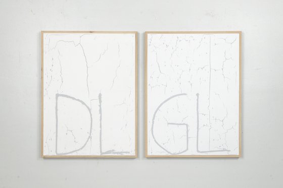
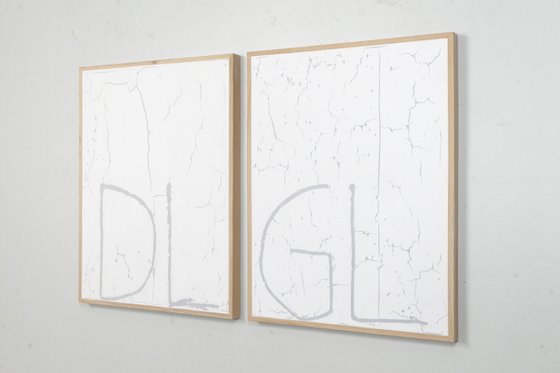
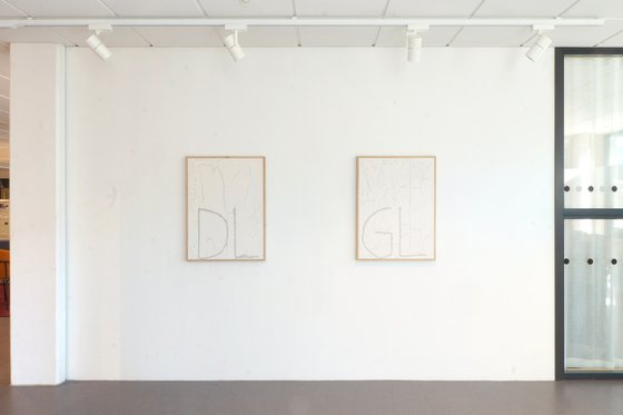
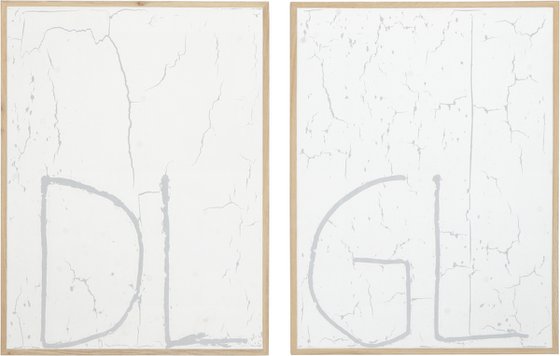
128x84 cm (64x84 cm each panel), installation dimensions variable | Filler, oak panel and oak panel with birch backboard
The letters on these double works stand for Grand Lux and De Lux. Anyone who owned a Volvo in the ’70s or ’80s knows this from their models. Volvos business strategy was first to introduce an expensive model for people with money - the GL. A year later, they released a more affordable one - the DL. The GL had a more potent engine and extra luxury items, but the exterior looked the same! Except for the tiny indicators of the letters on the back.
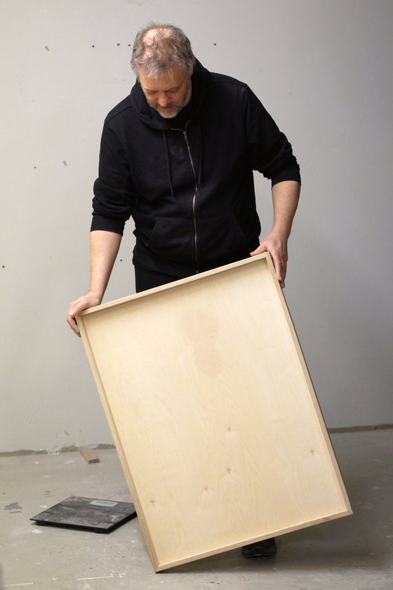
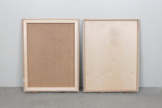
So I decided to do two works using the same strategy. My GL has a more exclusive birch back panel and a slim new design without the supportive pine strips. But except for the letters, they look inseparable when mounted on the wall. The artistic value of the works might be the same, but the GL version is still more expensive. If something is more expensive, it also has to be worth more right?
Materials used:
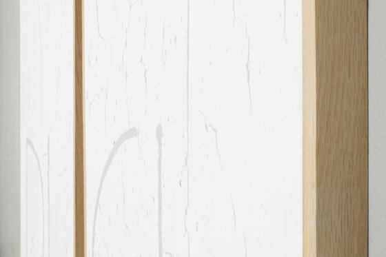
Filler (coarse and fine) in oak frame
Tags:
#abstract #painting #minimalism #filler #oak frame#405-06 De Lux Grand Lux (2021) Painting
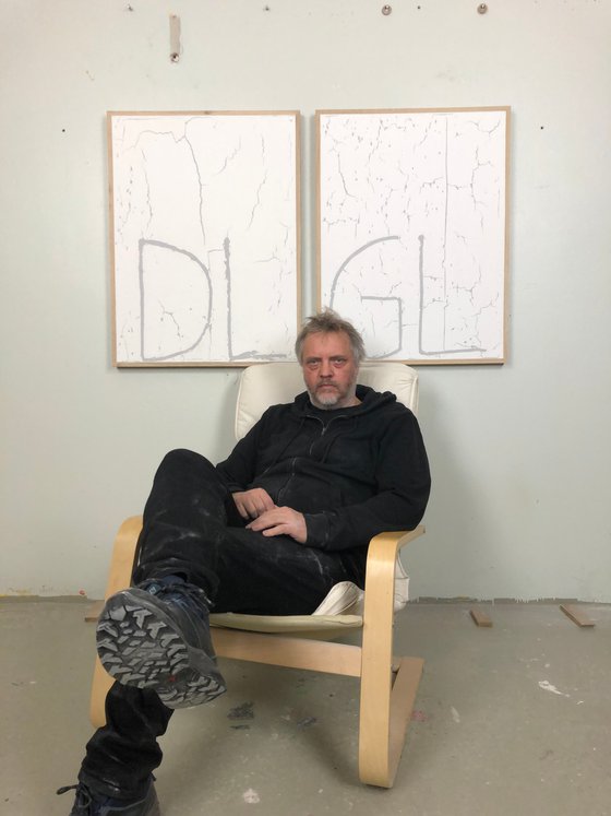
by Johan Söderström
1 Artist Reviews
£2,053.68
- Painting on Panel / Board / MDF
- One of a kind artwork
- Size: 133 x 84 x 5cm (framed)
- Framed and ready to hang
- Signed on the back
- Style: Typographic
- Subject: Abstract and non-figurative
Loading
Original artwork description
128x84 cm (64x84 cm each panel), installation dimensions variable | Filler, oak panel and oak panel with birch backboard
The letters on these double works stand for Grand Lux and De Lux. Anyone who owned a Volvo in the ’70s or ’80s knows this from their models. Volvos business strategy was first to introduce an expensive model for people with money - the GL. A year later, they released a more affordable one - the DL. The GL had a more potent engine and extra luxury items, but the exterior looked the same! Except for the tiny indicators of the letters on the back.
So I decided to do two works using the same strategy. My GL has a more exclusive birch back panel and a slim new design without the supportive pine strips. But except for the letters, they look inseparable when mounted on the wall. The artistic value of the works might be the same, but the GL version is still more expensive. If something is more expensive, it also has to be worth more right?
Materials used:
Filler (coarse and fine) in oak frame
Tags:
#abstract #painting #minimalism #filler #oak frame14 day money back guaranteeLearn more
