If you've ever wondered where the written word collides with visual art, look no further than typography. This versatile art form gives artists the power to incorporate lettering and messaging into their artworks, whether it be scattered loosely in the background or the focal point of their piece.
There is so much an artist can do with typography, and you'll most likely have come across it in art galleries, urban spaces and local print shops. Today, we're taking a closer look into how it all started, and what trending typographic artists you should be on the look out for.
What is typography?
At its most fundamental, typography is the art and technique of arranging text to make written language readable and visually appealing. You’ll most commonly find this art form within graphic design and digital communication, with designers choosing to arrange type in different ways to evoke different emotions, set the tone of a piece, and create a unique selling point for products or services.
In the world of fine art, however, typography has evolved into a more defiant and powerful medium, with some modern typography rooted in graffiti and street art but now recognised as a contemporary art form in its own right. Typographic artists work with text, sometimes on its own but sometimes alongside imagery, to create a relationship between the look of the text and the meaning behind the words. They do this by manipulating the colour, shape, and style of the text to convey different meanings and change the tone of an artwork.
A brief history of typography
You can trace typography back to ancient times, from Paleolithic cave paintings dated around 30,000 years ago to the development of the first formal writing by the Sumerians at around 3,500 BC.
Then, the creation of the alphabet sparked a new journey of design, allowing artists and designers to use text within their artistic spaces and create more visually appealing typescripts.
In the 15th century, a man called Johannes Gutenberg developed the movable type and printing press, which was a turning point for the modern world and for modern typography. By the time of the industrial revolution, typography had become a means to communicate with the wider population, through posters, signs, newspapers and more. This led to the use of a bolder, more graphic style of lettering which has stuck with us until the present day, and you’ll often see similar styles used in contemporary typographic art.
Typography now
By allowing artists to merge traditional letterform design with modern artistic expression, typography has found its voice within contemporary art. This genre extends beyond just readability of text, allowing artists to transform letters and words into visual art forms in playful and exciting ways. These artworks are as much about aesthetic impact as they are about conveying a message, and often the text is displayed in a rather abstract way so as to make the viewer work harder to read the words themselves.
By manipulating the size, shape, and placement of letters, artists can evoke emotional and intellectual responses from their viewers and reflect cultural narratives and social commentaries. Typographic art has also infiltrated into public spaces, turning mundane urban environments into vibrant canvases that invite public interaction and reflection. The creativity of typographic artists is truly endless, and you can expect to see fresh takes on the art form pop up all over the world for years to come.
One standout artist on Artfinder, Babak Ganjei, pushes boundaries with his darkly humourous typographic artworks. Based in London, UK, Babak is a versatile talent: a visual artist, comic book writer, musician, and radio presenter. His unique creations, inspired by 1990s music and comedy, are marked by their energy, humour, and unpredictability. Babak's typography art serves as an inner monologue, with his handwritten text often poking fun at elements of human vulnerability.
Another Artfinder typographist we just love is the wonderful Anita Kaufmann. Since 2018, Anita has been captivating Artfinder audiences with her unique mixed-media artworks. Her series, “Love the Sea,” incorporates elements of typography. She uses the ICAO (International Civil Aviation Organization) alphabet, the phonetic communication system used in aviation and sailing, to craft her quotes. Set against dark backgrounds much like the sea, the bold and clean typography creates a sense of balance and harmony, inviting viewers to decipher the letters and engage with the piece.
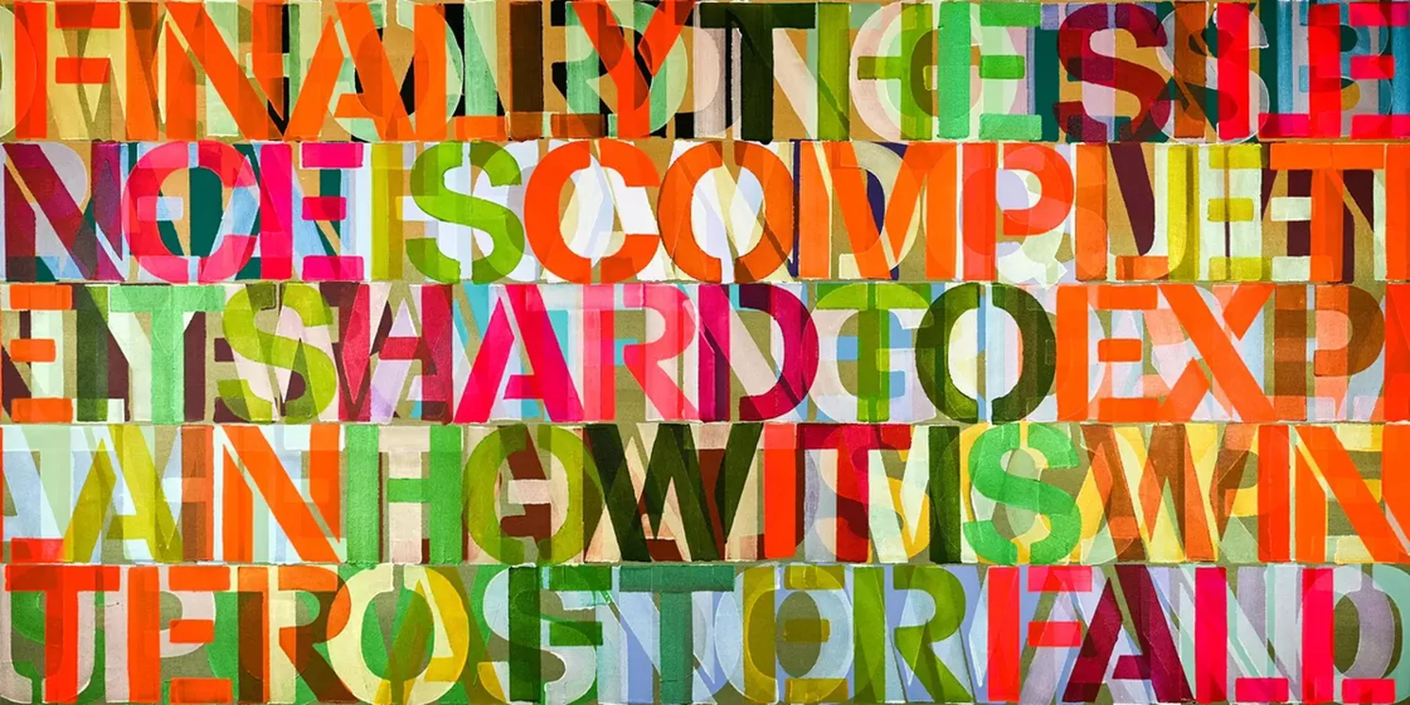
And one final trending typographist you should know about, if you don't already — Artfinder artist Niki Hare, a UK-based mixed media artist. Her visual works frequently feature layers of messages and spoken word on canvas, expressed through bold and bright colours and fonts. Niki has collaborated with poets like James Hope on mixed-media projects, integrating multiple art forms into her work.
Header image: "Winter After Fall" by Niki Hare