- By medium
- By subject
- By budget
- Sales
- Gift cards
- Discover all art
- Artists
- Editors’ picks
- Ideas
Original artwork description:
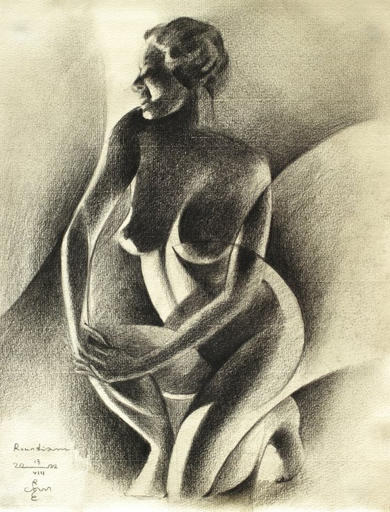
Something Different
And now for something completely different: Roundism again. After ‘Art Deco Nude – 11-08-22’ it was time to unleash my Faber-Castell Pitt Graphite Matt pencils on Roundism. I delved into my stash of art deco photographs and saw a suitable one, conducive to creating round shapes. Unfortunately I couldn’t retrieve the photographer’s name anymore but hail to him or her anway. In my art statement I also thank photographers from aforementioned era for their crafty and artistic approach. They keep on inspiring me to invent stuff based on their visual ideas, very much unlike contemporary model photography. Should I seek for a new word like ‘Neo Art Deco’? That sounds a bit presumptuous. What do you think?
Tonal Extremities
Perhaps it’s all-in the tonal values. I simply love tonal extremities, backlit forms, creating rhythym and diction. A perfect playfield for putting my theories on ‘variation in repetition and repetition in variation’ into practise. With these new pencils I can shift into a higher gear. Regular graphite pencil is not very dark but keeps a shiny silverish glow. I feel now that blackening planes is much easier now and gives me that extra bit of darkness. It feels as if I have to be careful not to overdo it. Regular graphite forced me to keep on hatching, almost risking damaging the paper. Luckily the grainy structure prevents me from hatching too frantically.
Composition
I didn’t need much styling this time. Only in the hip section, the elbows and the right calf I made my typical roundism markings. I chose for hatching only certain parts to a perfect black, for example in the corners of cross sections. By letting run the curves off paper in the mid-section I prevented the female form from ‘floating’. That is a phenomenon in art indicating objects are not really embedded in the negative space around them. In the reference picture there were plenty of midtones and darker tones around the model. Therefor, extrapolating curves outside the body was the solution. As to the resolution, of course the Ingres paper show less resolution. I feel this offers more an added value than is an obstacle. More to create and I cannot wait to start a new one.
Pitt Graphite Matt pencil (Faber-Castell) drawing on Hahnenmühle paper (24 x 31 x 0.1 cm)
Artist: Corné Akkers
Materials used:
Pitt Graphite Matt pencil (Faber-Castell) drawing on Hahnenmühle paper (24 x 31 x 0.1 cm)
Tags:
#cubism #chiaroscuro #artistic nude #roundism #cubist nudeRoundism – 13-08-22 (2022)
Pencil drawing
by Corné Akkers
8 Artist Reviews
£1,289.75
- Pencil drawing on Paper
- One of a kind artwork
- Size: 24 x 31 x 0.1cm (unframed) / 24 x 31cm (actual image size)
- Signed on the front
- Style: Surrealistic
- Subject: Nudes and erotic
Original artwork description
Something Different
And now for something completely different: Roundism again. After ‘Art Deco Nude – 11-08-22’ it was time to unleash my Faber-Castell Pitt Graphite Matt pencils on Roundism. I delved into my stash of art deco photographs and saw a suitable one, conducive to creating round shapes. Unfortunately I couldn’t retrieve the photographer’s name anymore but hail to him or her anway. In my art statement I also thank photographers from aforementioned era for their crafty and artistic approach. They keep on inspiring me to invent stuff based on their visual ideas, very much unlike contemporary model photography. Should I seek for a new word like ‘Neo Art Deco’? That sounds a bit presumptuous. What do you think?
Tonal Extremities
Perhaps it’s all-in the tonal values. I simply love tonal extremities, backlit forms, creating rhythym and diction. A perfect playfield for putting my theories on ‘variation in repetition and repetition in variation’ into practise. With these new pencils I can shift into a higher gear. Regular graphite pencil is not very dark but keeps a shiny silverish glow. I feel now that blackening planes is much easier now and gives me that extra bit of darkness. It feels as if I have to be careful not to overdo it. Regular graphite forced me to keep on hatching, almost risking damaging the paper. Luckily the grainy structure prevents me from hatching too frantically.
Composition
I didn’t need much styling this time. Only in the hip section, the elbows and the right calf I made my typical roundism markings. I chose for hatching only certain parts to a perfect black, for example in the corners of cross sections. By letting run the curves off paper in the mid-section I prevented the female form from ‘floating’. That is a phenomenon in art indicating objects are not really embedded in the negative space around them. In the reference picture there were plenty of midtones and darker tones around the model. Therefor, extrapolating curves outside the body was the solution. As to the resolution, of course the Ingres paper show less resolution. I feel this offers more an added value than is an obstacle. More to create and I cannot wait to start a new one.
Pitt Graphite Matt pencil (Faber-Castell) drawing on Hahnenmühle paper (24 x 31 x 0.1 cm)
Artist: Corné Akkers
Materials used:
Pitt Graphite Matt pencil (Faber-Castell) drawing on Hahnenmühle paper (24 x 31 x 0.1 cm)
Tags:
#cubism #chiaroscuro #artistic nude #roundism #cubist nudeReturns and refunds
We want you to love your art! If you are not completely satisfied with your purchase you can return it free within 14 days, no questions asked. Learn more
Artist Reviews (8)
This artwork is sold by Corné Akkers from Netherlands

Corné Akkers
Netherlands
About
Born in 1969 at Nijmegen. Corné's work can be seen in many countries all over the world.
Corné employs a variety of styles that all have one thing in common:... Read more

